Foreword: Please do not trust Samsung Notes with important work. The sync is not reliable and can lose your work. I discovered this a day after publishing the video review. This written review has not been amended to reflect this, so please keep this in mind whilst reading.
Contents
Video Review
Introduction
This is my detailed review of the Samsung Galaxy Tab S7+, which released in the UK on August 21st, 2020. Since I sent my second and final Galaxy Book Flex back to Samsung, I had been looking at Galaxy Tab devices as a potential replacement. I did not expect the build quality issues to exist on this line, but the S6 was a bit too small for my liking. I paid attention to the rumours of a 12"+ variant with a 120Hz SAMOLED display, and I was very intrigued. After the S7 series was announced at Galaxy Unpacked, I ordered an S7+. In this review I will cover my experiences with the device, provide an honest product review, and if you already have one of these, I aim to help you to get the most out of it. The video review will provide additional perspective. So, let's continue.
Here is the detailed spec sheet:
| CPU | Snapdragon 865+ |
| iGPU | Adreno 650 |
| Memory | 6GB (8GB available in most markets, but not the UK) |
| Storage | 128GB UFS 3.0 (256 and 512GB available in other markets) |
| Battery | 10,090 mAh |
| Security | Fingerprint sensor (optical, under-display) |
| Display | 12.4" 120Hz SAMOLED, 2800x1752px, 16:10 aspect ratio, 446cm2, 266 pixels per inch, "HDR10+" |
| Input | Touch Digitizer, Wacom EMR Digitizer (including S-Pen with bluetooth gestures), volume and power keys |
| Mass | 575g |
| Dimensions | 285mm x 185mm x 5.7mm |
| Initial Operating System | Samsung One UI 2.5 (Android 10). Should receive up to Android 13/One UI 5.x |
| Colour | Mystic Black (Also available in Mystic Bronze and Mystic Silver) |
| Cameras | Rear: 13MP, 5MP. Front: 8MP. |
| Microphones | Two |
| Networking | Wi-Fi 6, Bluetooth 5 (4G and 5G also available) |
| Ports | USB 3.2 Gen 1 over Type-C, microSDXC, official keyboard connector |
| Charger | Samsung 15W travel adapter with USB-C connector (Device supports up to 45W, but the included charger supports only 15W), with 1m cable |
| Other | Two ambient light sensors |
Unboxing Experience and Included Accessories
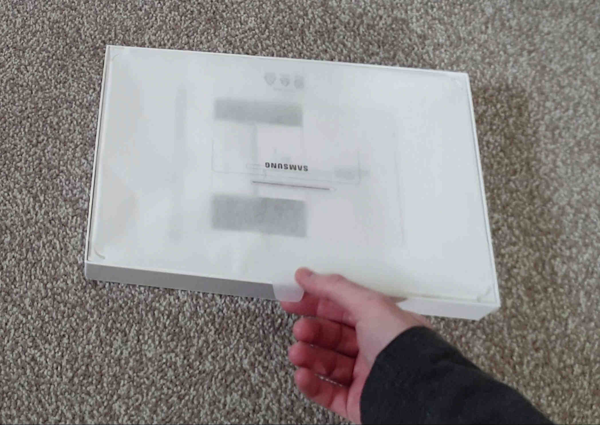
The box is very compact. To open it, I held the sides of the lid and shook it lightly up and down until the bottom portion slid out. Aside from the tablet, the box contains the pen, manual box, SD tray ejector pin, charging plug, charging cable (1m length), and nothing else. Not even replacement pen tips or a type-c to 3.5mm adapter. Regarding pen tips, Samsung claims the single included tip should not require a replacement, as it will last longer. I find this hard to believe - the tips are designed to wear eventually, and not including replacements, and also not selling them, is disappointing.
Apparently these tips are compatible, but I have not tested them myself*: https://estore.wacom.com/en-GB/accessories/accessories-nibsc/wacom-pen-nibs-felt-10-pack-ack22213.html
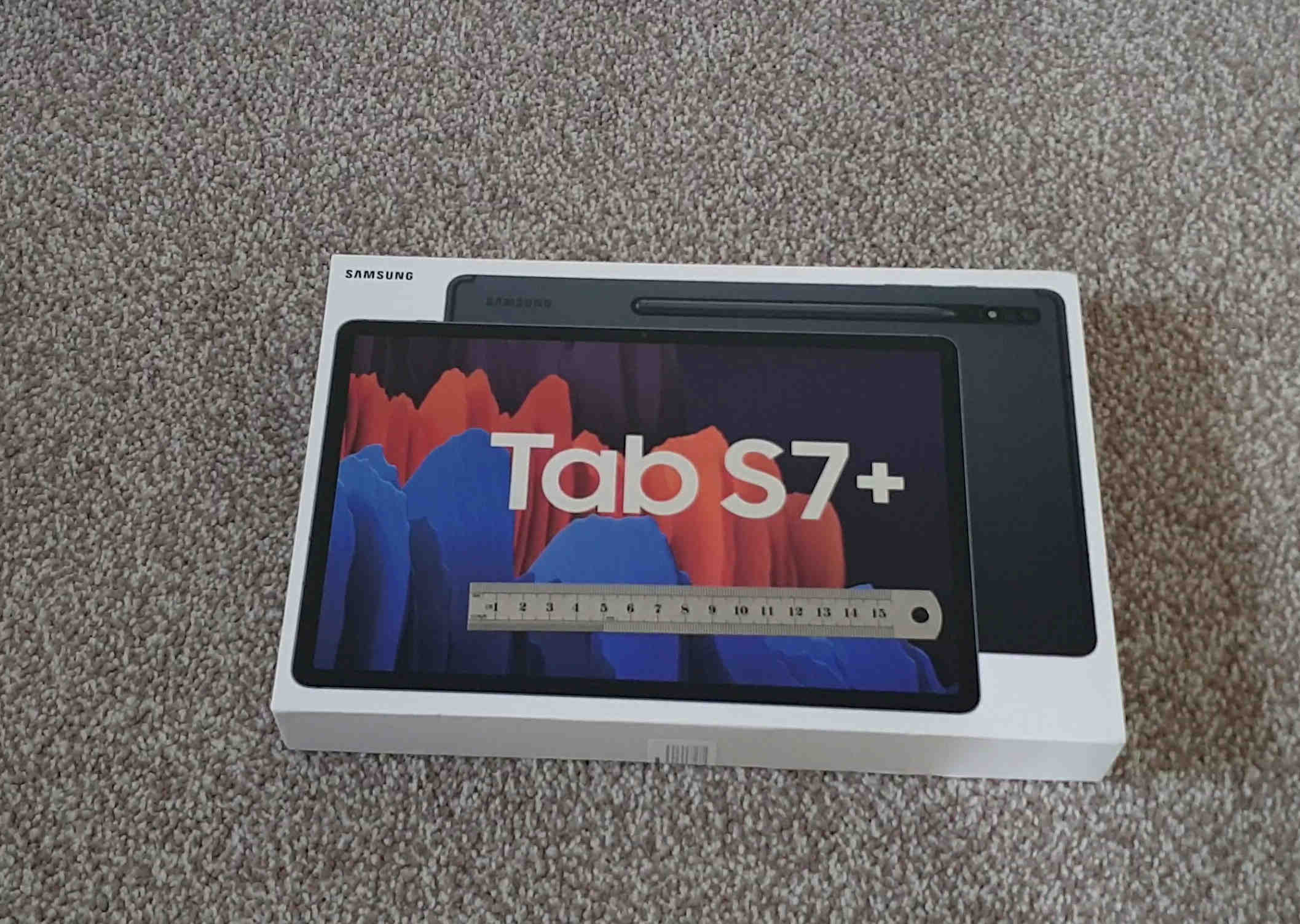
The box.
This pouch contained the tablet. It has a pull tab on the side to lift it from the box. The pouch then opens like an envelope.
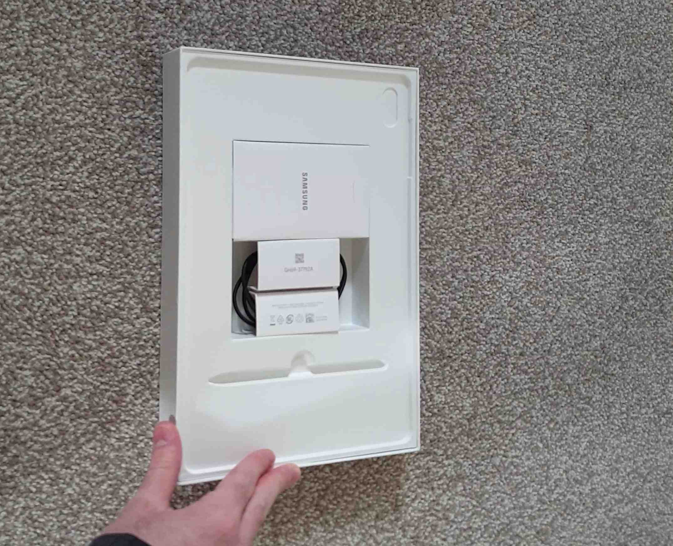
The accessories compartment. This originally contained the travel adapter charging plug, cable, pen, and manual box.
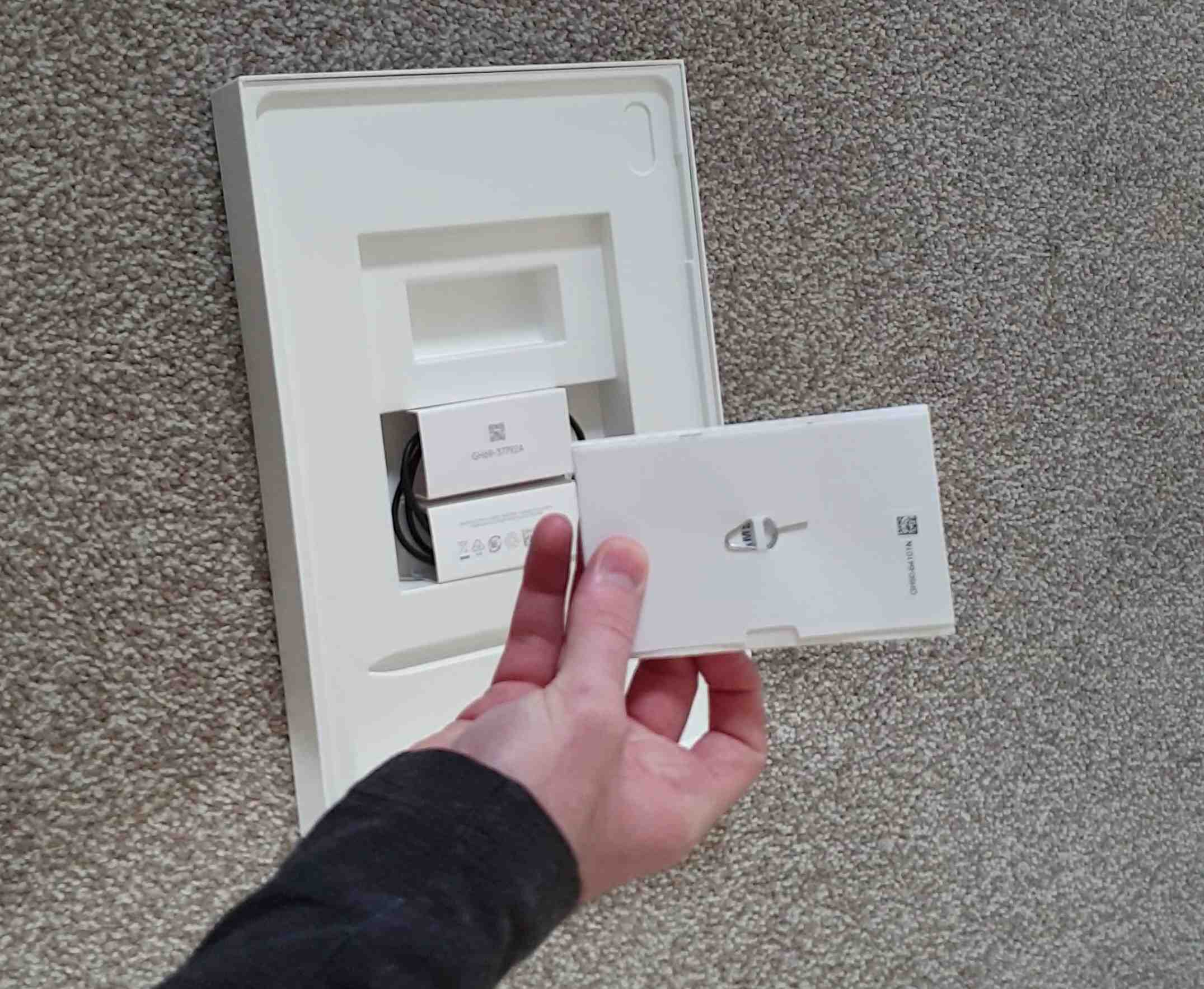
The rear side of the manual box contains the ejector pin for the SD tray.
Build, Appearance and Design
When picking up the tablet, I immediately appreciated how thin and light it was. This device seems to be the thinnest of its kind, coming in 0.2mm thinner than the iPad Pro 2020 models (5.7mm vs 5.9mm). The body is aluminium and the front is glass, as expected. The device weighs in at 575g, which is pretty light. It weighs about half way between the two iPad Pros, and is much lighter than my old Surface Pro 4, which has very, very slightly more screen space but is much heavier. It also has roughly the same battery capacity as a modern Surface Pro, but lasts much longer.
The device feels very premium and the low weight and thin design is something you will continue to appreciate. The device has brushed aluminium edges, and along these edges we have only one actual port, which is listed as USB 3.2 Gen 1 and uses a Type-C connector, supporting 5Gbps of data transfer. They could have used USB 3.2 Gen 2, which supports 10Gbps. We have a microSD slot, and there is no headphone jack. This is one point that I knew I would not like, but the problem is that no devices in this category use 3.5mm jacks anymore. I think they are a great convenience feature. I did purchase a Samsung Type-C to 3.5mm adapter, and these adapters are a complicated technology, but my issue is that I feel the connector is more fragile than a headphone jack and I do not like to repeatedly plug in and out of it. To put my mind at ease, they could have at least added a second USB port.
I've got the Mystic Black tablet here, but it also comes in Mystic Bronze and Mystic Silver. I chose Mystic Black over Mystic Silver as I think the silver looks too white. I did state previously that I like to avoid painted metals, but I think they are all painted anyway, and black is my preference. I feel that Mystic Bronze is the Samsung version of Apple's Rose Gold and that colour is not for me.
Webcam and Microphones
These are pretty decent, and certainly better than most laptops. The two microphones work well and the front and rear cameras are good enough to get the job done.
Display
The display is very unique, and one of the main selling points of this device. For many, it will be the primary selling point. This device uses a 120Hz SAMOLED (Super Active Matrix OLED) panel at a resolution of 2800x1752 pixels, with a pixel density of 266 ppi (pixels per inch). In my opinion, the ideal display has three things - High refresh rate, OLED, and Gsync. This display checks the first two, and I can understand why it does not have Gsync. A display checking even two of these is very rare outside of gaming monitors, and this is the first display to do so on any tablet. This is something I knew I would like.
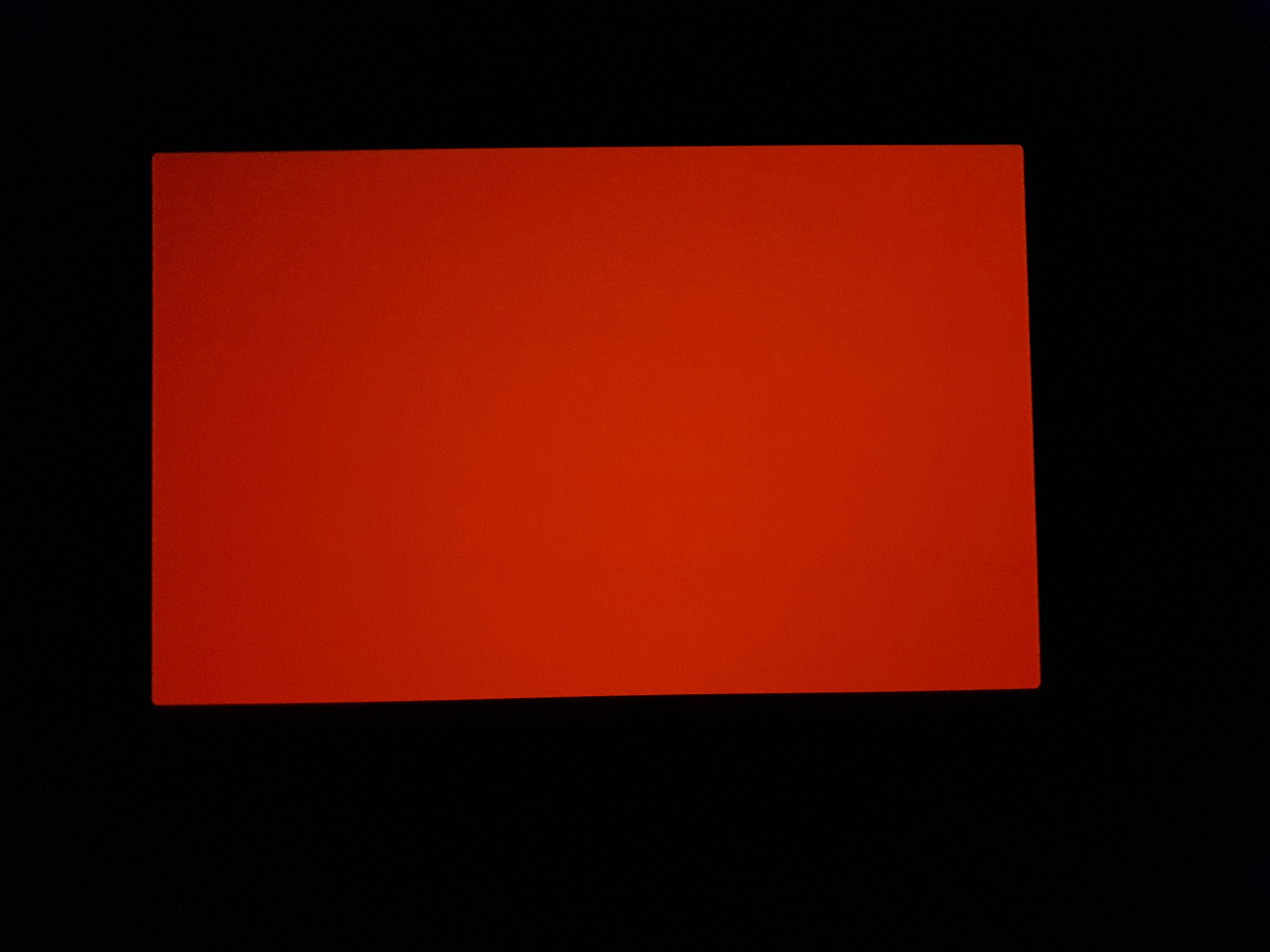
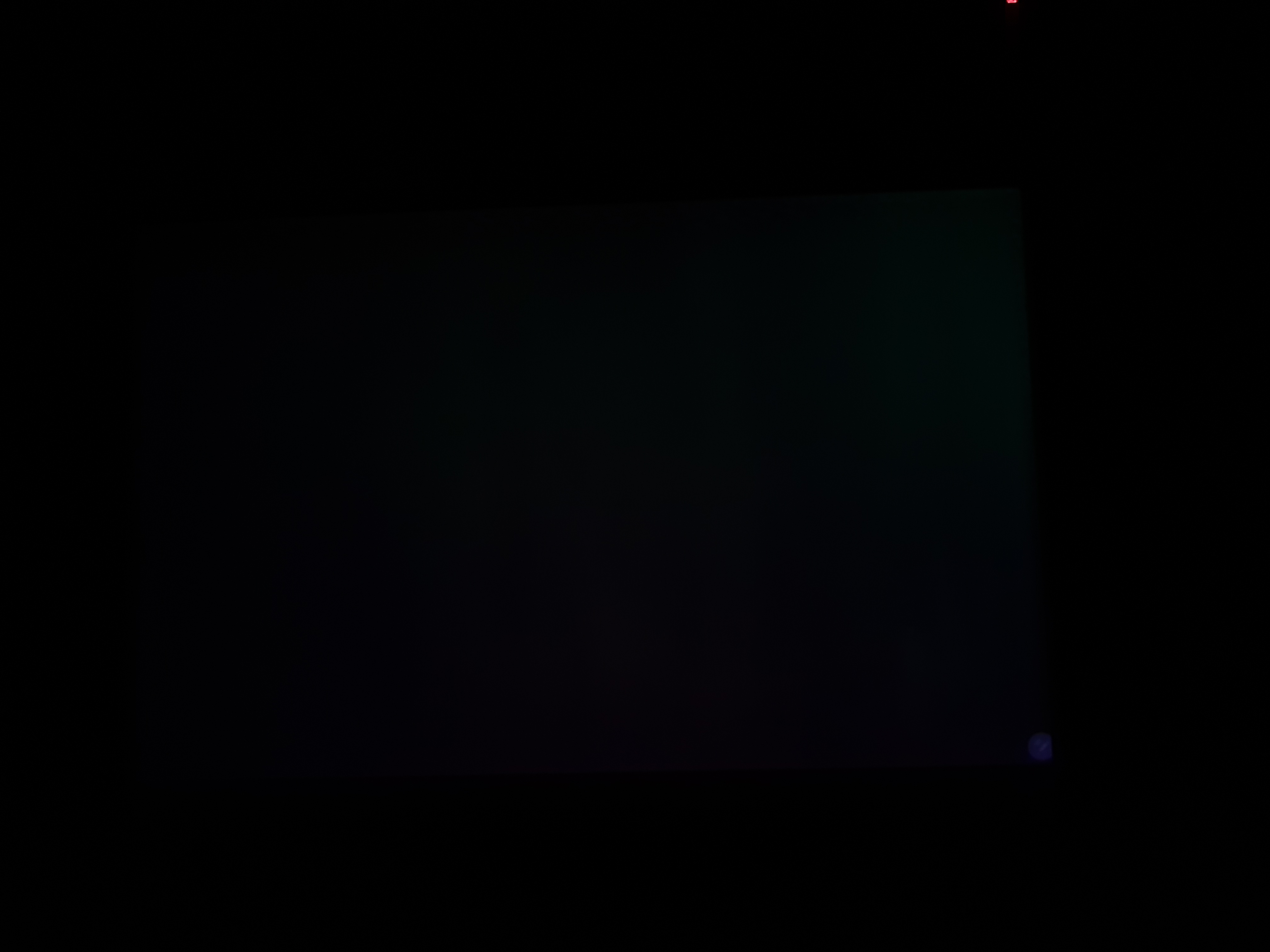
The benefits of OLEDs speak for themselves when viewed. The display will appear more vibrant than those built with competing technologies, and all users will appreciate this for consuming media. Colours will stand out and appear more pleasing to the eye. More important than this, in my opinion, is that the display is capable of displaying true black. This may sound like a strange compliment to those unfamiliar with display technology, however other technologies do not display black; rather, they display grey. See below for an example of a pure black (#000) image displayed on a Surface Pro 4, and a Galaxy Tab S7+.
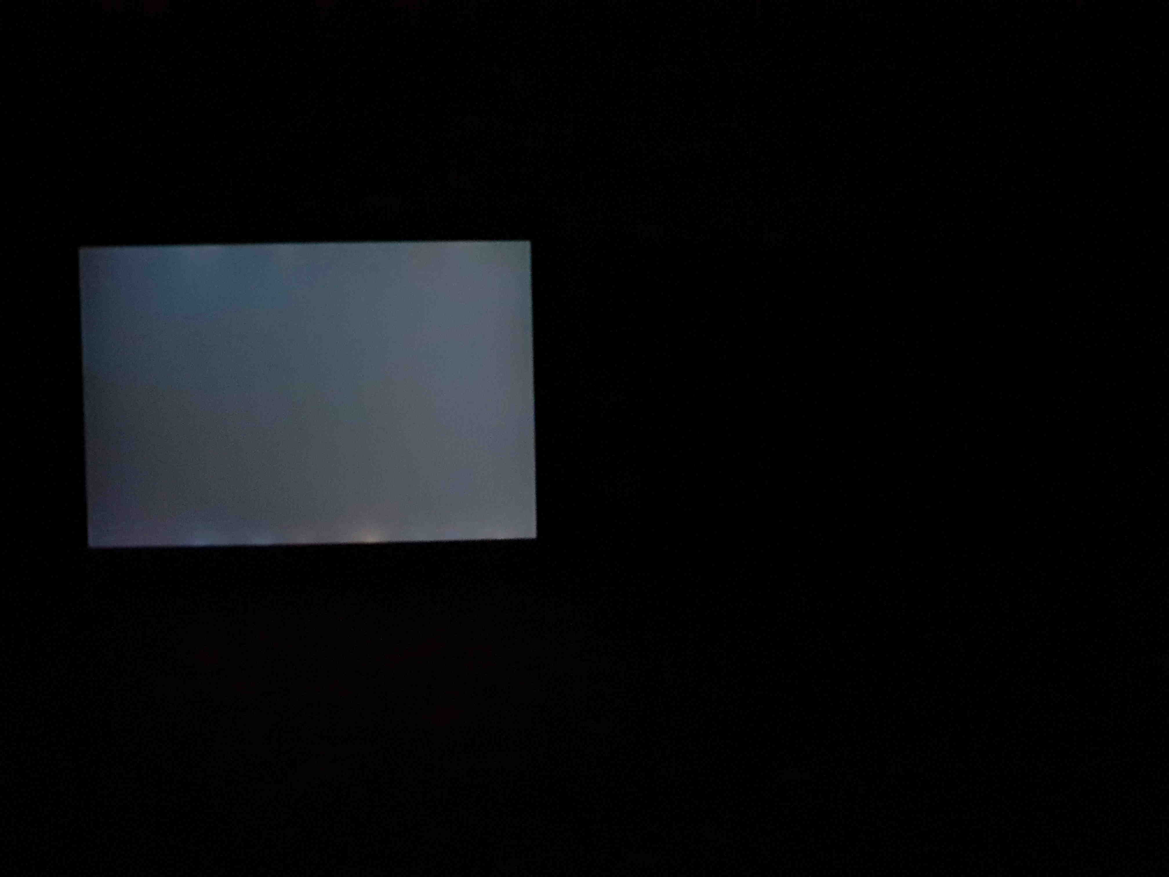
A black image (#000) displayed on the Surface Pro 4 (left, 100% brightness) and the Tab S7+ (right, 100% brightness).
Viewing the above image, the difference is astonishing; and you may find it hard to believe that the same colour is being displayed on both devices. You cannot even see the Tab. Let me explain.
LCDs are back-lit. This means that the pixels do not produce their own light. In order to be visible to us, a bright light is placed behind them. When I was younger, I had a GameBoy that had an optional back-light. In the day, I could do without it as ambient light made the pixels visible; but at night I could not. That device used the same concept, but due to battery life issues, you would make do without the backlight when you could. On a modern display of more acceptable quality, when anything is displayed, the entire back-light has to be switched on; and this pollutes the black pixels by providing light to them, resulting in grey. In the above examples, the Surface is edge-lit (the light comes from the edges), and you can see that the light actually bleeds out of the edges. This is a common quality control issue with Surface devices, but it is not uncommon for LCDs to do this.
In contrast, OLEDs are not back-lit in any way. Instead, each individual pixel provides its own light, and each pixel can be individually switched off. The colour black is not really a colour, rather it is the absence of all light. To display black, we would optimally turn off the pixel entirely, and that is precisely what happens with OLED displays. If the pixel is off, it emits no light, and so we get a true black. The ability to switch off pixels entirely and produce no light from them means that the contrast ratio for any two colours, where at least one of them includes black, is infinite. This helps to make things appear more defined.
This effect shows clearly in any media with dark content. Characters in movies who step into, or out of the darkness, appear to pop in and out of existence in a way that just cannot occur with an LCD. It almost lends depth to the media, and is to me more important than the vibrancy advantages. Using an OLED for darker media should provide you with a new appreciation for it.
Watching media is not a primary use case for me, so I most appreciate this specific OLED feature when using true a dark mode, sometimes referred to as an AMOLED dark mode, where the background is pure black. On the pure black background, you have light text. The benefit to this is that much less light is emitted from the display, reducing eye strain for some people. You can see an example of such a theme on my website if you open the hamburger menu to the top right and click the theme button. I choose this theme when reading, and it's much more comfortable for me.
I am a user who prefers this theme at all times of day, however I think many regular users will at least appreciate it at night. Try it out in a dark room and see what you think. The chances are that you are using an LCD as your display, so light will be emitted from the black areas. On OLED displays, all black areas are truly black, as you see above.
Display Issues
Sadly, the display is not perfect and does have some issues. The touch sensitivity is too high, which means you can click things without physically touching the display. To replicate this issue, do the following:
- Touch the display with a finger
- Slowly pull the finger away from the display, so that it has just lost contact
- Move the finger, and you will find that you can still scroll even though you are not touching the display
This is the easiest way to replicate the issue, but you do not need to touch the display to activate this behaviour. If you very carefully bring your finger close to the display, it will start to register touch events before contacting the display. At first, I found that I was accidentally clicking things sometimes, or activating long press events, or scrolling the page slightly when lifting my finger. This occurred because I would keep my finger very close to the display before touching, and after lifting my finger. If you lift your finger just off of the display, you can even move it a bit further and it will still scroll things. It provides a similar effect to increasing the touch sensitivity on my Note 9, for use with gloves (Settings > Display > Touch sensitivity); though curiously, this setting does not exist on the Tab. I would assume a slider for this would be relatively simple to implement. This issue does give me trouble sometimes. I've mostly adapted to it, but that should not have been necessary. The work around is to not keep your finger so close to the display. I do think this is an important defect to point out, and it should not exist.
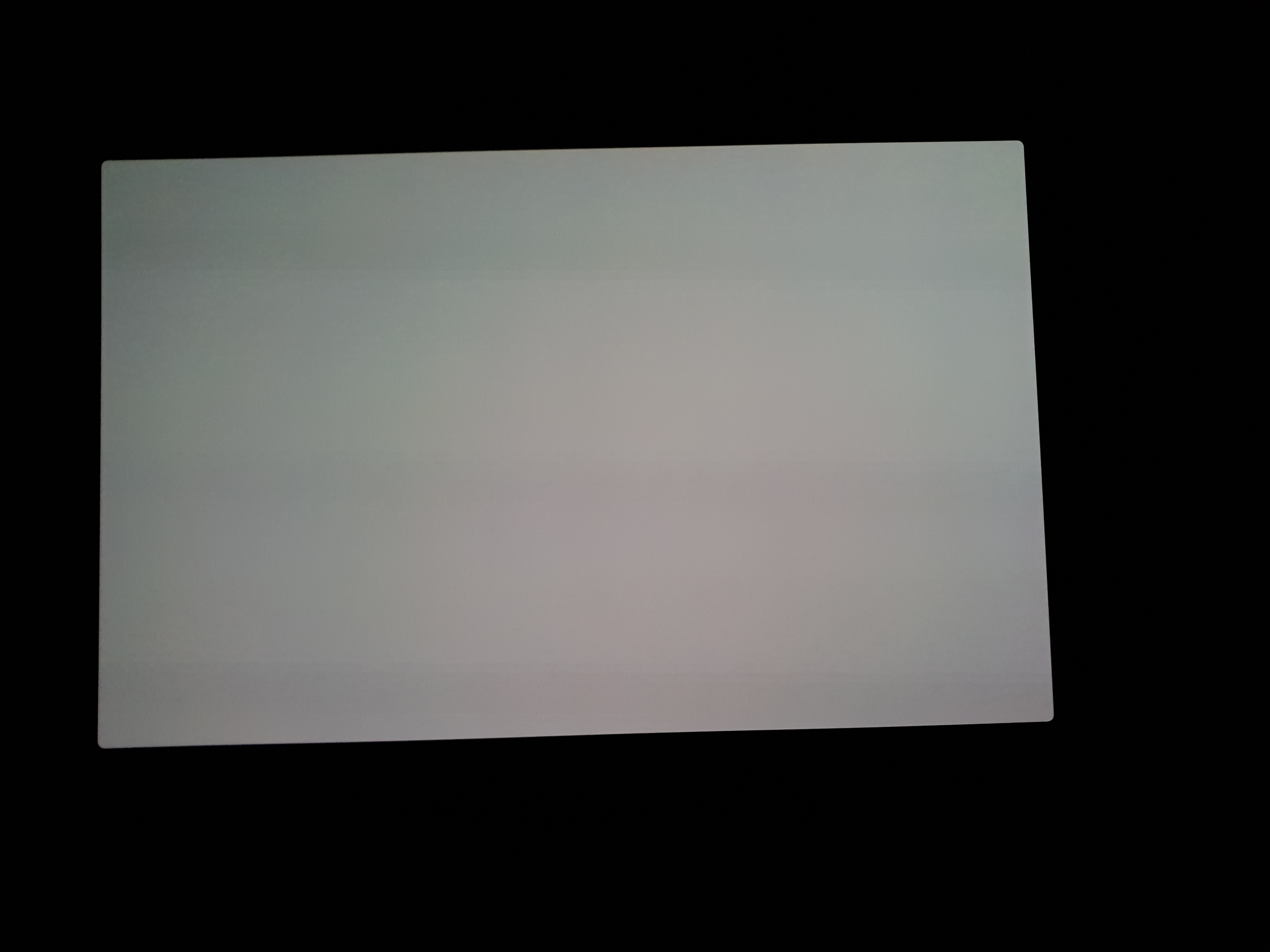
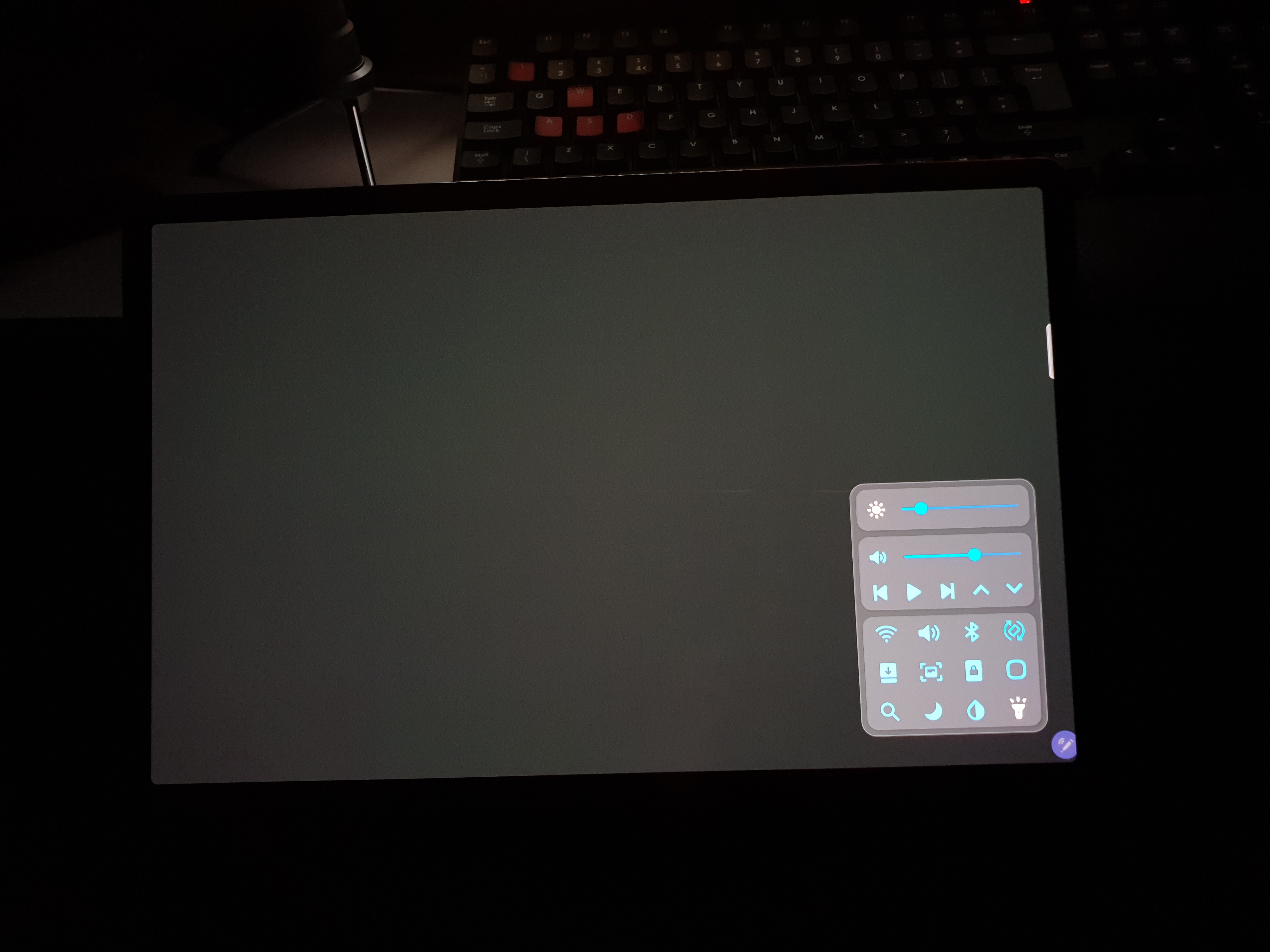
Additionally, there is a green tint issue at low brightness. I have not seen many photographs of this, but on mine it usually only visibly affects grey backgrounds, and only at low brightness values. Specifically, it seems abnormally bad at the first brightness value after zero. See this value from the first image below - the slider has such a low value that it appears to be zero, but it is very slightly above zero. The effect at zero is not nearly as bad. At this brightness value just above zero, I tested pure white, red, green and blue. To my eye, all of these appear perfectly fine. Even white appears fine to my eye. I have only noticed this effect on grey backgrounds. For illustration purposes, I settled on a very dark grey with hex code #191919. The darker you get, the more obvious the tinting becomes; but it is not visible on pure black (#000). This is because at pure black, the pixels are physically off and so they cannot be tinted.
My methodology for taking these photographs was to set the "almost 0% brightness" value and photograph it. Without changing the brightness, I then cycled between each test image and photographed it. I used Pro Photo mode for manual focus.
The brightness value just above zero, where the green tint appears worst. This brightness value is referred to as "almost 0% brightness" in this review.
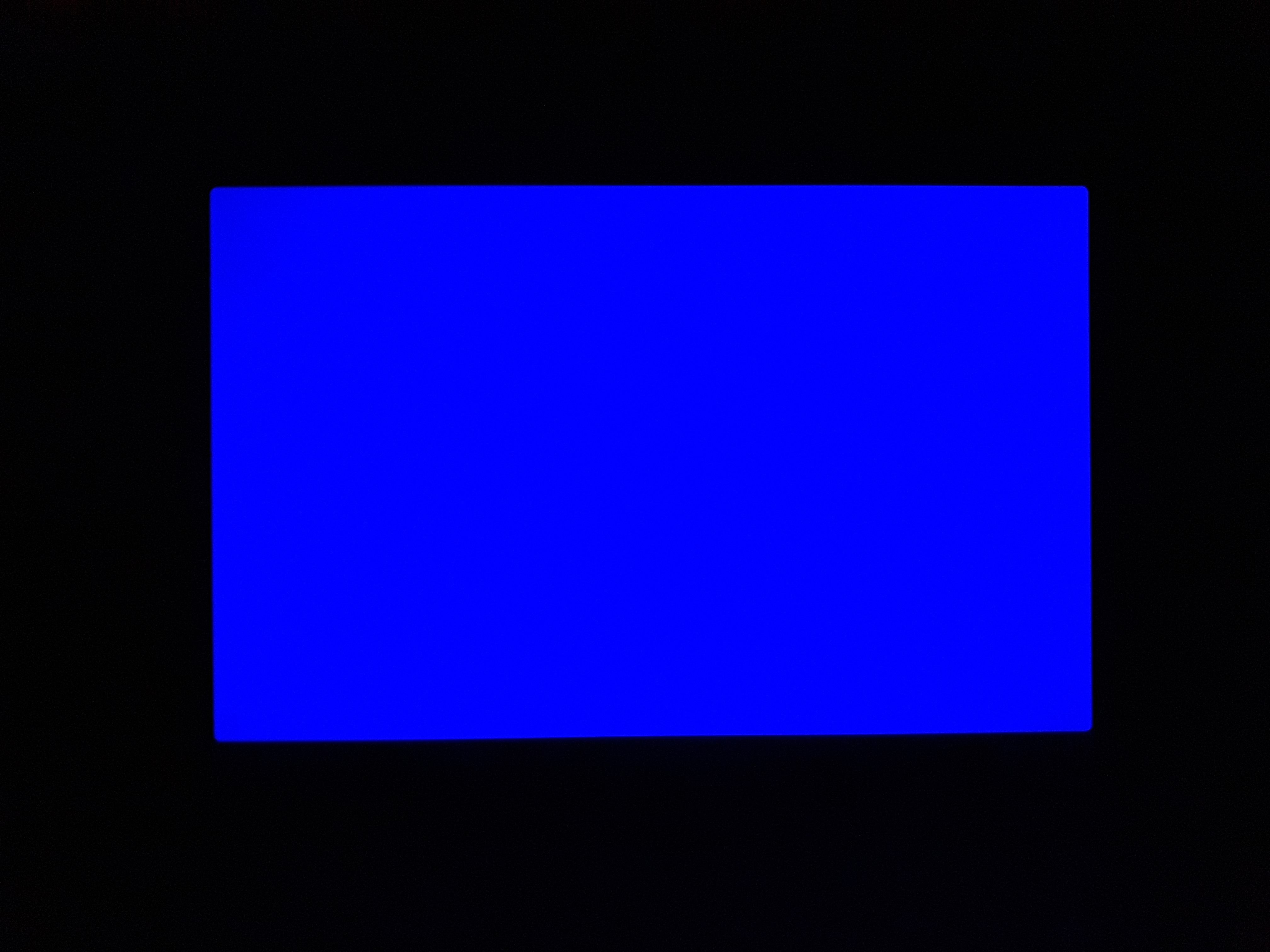
Almost 0% brightness blue (#0000FF).
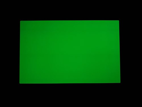
Almost 0% brightness green (#00FF00).
Almost 0% brightness red (#FF0000).
Almost 0% brightness white (#FFF).
Almost 0% brightness very dark grey (#191919).
0% brightness very dark grey (#191919).
0% brightness very dark grey (#191919)
~17% brightness, very dark grey (#191919).
As you can see, the tinting appears quite bad on a dark grey when viewed just over 0% brightness. I just want to remind you here that this is a very specific test case at almost 0% brightness, designed to exacerbate the issue. I have done this to better demonstrate and test the extreme cases of this issue. It does not look like this in the majority of situations. At higher brightness, the effect goes away. I say it is fine above 15% but the effect is barely visible at 10%. The effect is also worse at 120Hz than at 60Hz, but switching to 60Hz does not eliminate the issue. These effects are difficult to capture with my camera so I do not have photographs of this.
Again, this only affects low brightness values so most users will probably never see it, and even at low brightness values, it's fine as long as you do not have grey backgrounds. Still, it is a notable issue with the display, and one that affects me as a low brightness user, particularly at night.
As good as Samsung's OLEDs are, they are not flawless. There is a tinting issue at some very low brightness values, which is an important issue, but aside from that the display appears gorgeously vibrant, with the deepest blacks and a high refresh rate to permit content to flow smoothly. It is exceedingly pleasant to use, and anyone considering a high quality display to be their primary desire from their portable device should generally look no further than this one right here.
Security
The device uses an optical fingerprint sensor beneath the display. It works well enough, but it is not as good as the one I tested out on the Galaxy Book Flex - that one worked faster and a little more reliably. In-display fingerprint sensors are either ultrasonic or optical, and you can tell that this one is optical as once you place a finger onto the sensor, all of the pixels above it will turn bright white to illuminate your print.
Although the sensor is technically not as good as the one on the Galaxy Book Flex, which used a more regular sensor placed on the keyboard, the placement for this sensor is quite good. They could have put one on the side of the tablet like they did with the S7, and I am sure that is absolutely fine, but having it underneath the display makes it an on-screen button and that does help with usability. I find that it is easy to reach in all scenarios.
Having a Galaxy Note 9 as my smartphone, I do have an iris scanner, and I do use it. It would be nice to have that option on here. They seem to have stopped putting iris scanners onto their phones due to there no longer being a top bezel, but this device does have a bezel and although the fingerprint sensor is mostly sufficient, an iris scanner is sometimes more convenient.
Optical fingerprint sensor outlined on the display.
Pen
I like the specific pen that this device comes with. It feels slightly rubberised and that provides a nice grip. It has one flat edge that helps with grip, and this edge magnetically attaches to the charging point on the back. Opposite to the flat edge is one button, which is used for app shortcuts and air gestures, along with right clicking and dragging to select text (in supported apps).
Regarding the charging, let's get this out of the way - the pen will write perfectly with no charge. It contains a battery only for the gestures. When writing, the pen leeches power from the device through the magnetic field used to track it. If you don't like keeping it on the charger, you can pick it up at any time and instantly write with it. The battery life of the pen seems quite good. If I leave it off the back for 10 hours, it reports 80% charge when reconnected. It seems to only report in 20% steps, so there will be some error in that reading. Even if it is almost down to 60%, the next reported charge level, then 40% loss over 10 hours would provide 25 straight hours of charge. The battery life is long enough to use it as a remote control for many movies with air gestures - more on those soon.
In terms of storing the pen, I initially felt that the back of the device was a dumb place to put it. It just seemed like it would be in the way. In landscape, where I find myself spending most of my time, the pen is not in the way. Furthermore, I find that it helps to have the pen back there if you want to type on the touchscreen, as it raises the tablet to a slight angle. I did find two additional places it will stick to reasonably solidly. One is the top long edge, on the right side. This is another place to put then pen for landscape use. For portrait, there is a specific spot on the back I have found it to stick best to. This one takes some fiddling to find the optimal placement. The pen sticks at many angles around here, but I have found this specific placement to be optimal. This portrait one will take some learning. In terms of sticking the pen to the intended position on the back, I saw MKBHD say that it is difficult to do without looking. Using this tablet, I found that I could easily stick the pen there without looking after spending a little time with the tablet. I think the reason he felt that way is because, as a big iDevice fan, he probably did not spend much time with this tablet.
Primary pen placement, on the rear side, on the wireless charger.
Secondary pen placement, on the right side of the top long edge in landscape.
The pen sticks well here in portrait. It also sticks more loosely in a lot of areas around here. This is not intentional but is still useful.
If you do not like the included pen, you can use other compatible pens. You would want a modern Wacom EMR pen that is not compatible with Cintiq or Intuos devices. An older pen like the Surface Pro 1 and 2 pen may work, but may also have an offset - I'm unsure about that. A modern pen like the Staedtler Noris Digital works perfectly. Keep in mind that the air gestures require the included pen, but there are many others that should work perfectly for writing and drawing. The Noris Digital is better designed for drawing, enabling it to tilt a bit further. For me, I really like that EMR pens are so light. A Surface Pen is very heavy due to the nature of the technology, and an Apple Pencil is also on the heavier side for the same reasons. This is a preference thing, but EMR pens are lighter as most of the tech resides inside the tablet rather than the pen. The pen does not need to be loaded with sensors for tilt correction and power for writing, as the magnetic field emitted by the digitizer is instead responsible for this. Wacom EMR is a unique design and it enables us to have a real pencil, weighing as little as a real pencil, and that pencil is the Noris Digital.
I did not film a pen accuracy test this time. It is EMR so it draws perfect diagonals at any speed and a particularly interesting point is that the edge drift is almost non-existent. In fact, it pretty much only affects the corners. Edge drift is a drawback to EMR devices, where accuracy is typically reduced at the very edges of the display. My guess is that in order to accomodate the magnetic kickstand, the field strength of the digitizer was reduced, thereby reducing both the hover distance and the edge drift.
Latency
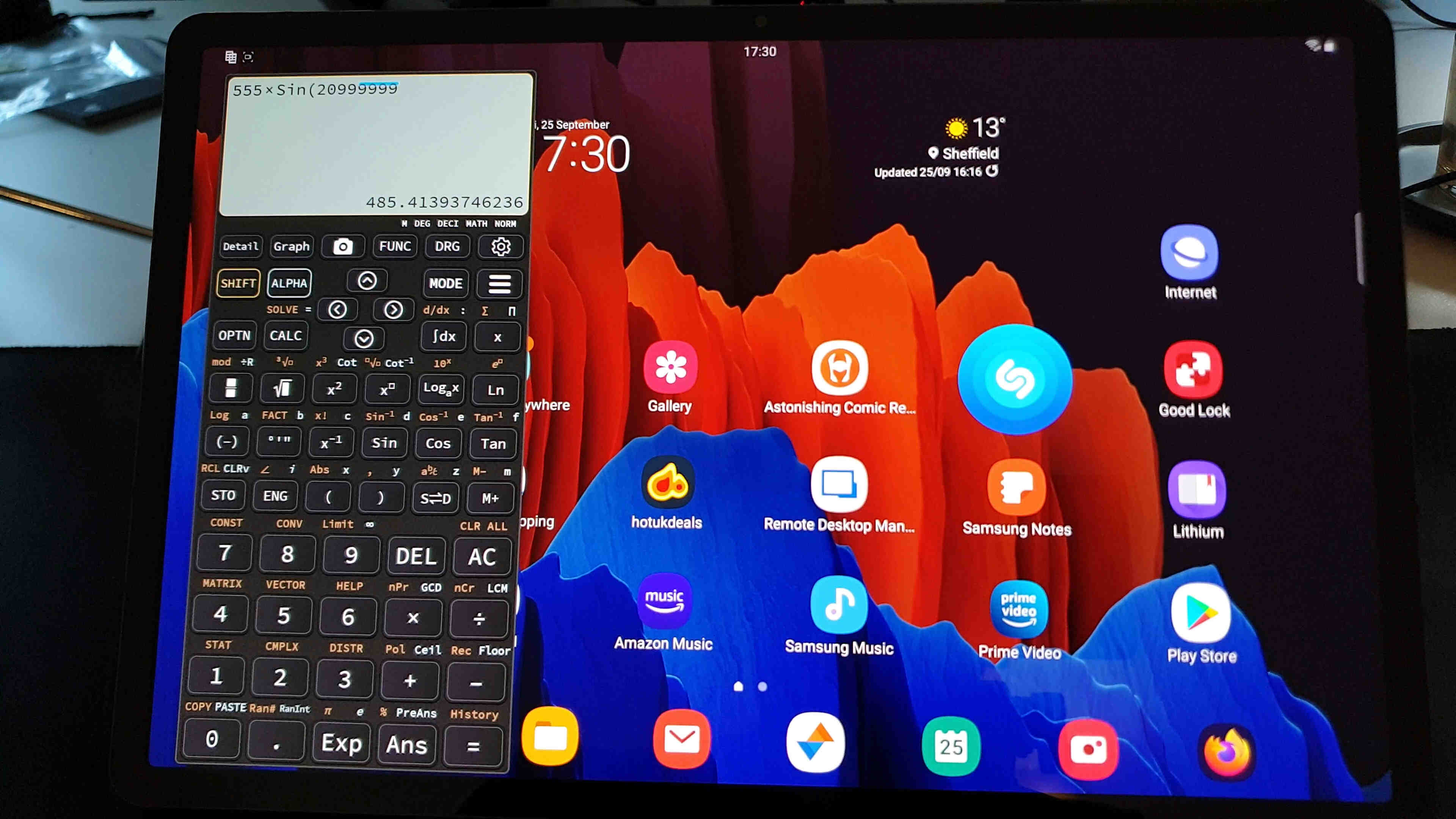
Samsung made pen latency one of their talking points. Using Samsung Notes, the pen latency is the best I have seen. The line appears to keep up with the pen with very nearly no latency at all, and I think most people would say there is no perceptible latency. It is very impressive. This covers all "brushes" in Samsung Notes, aside from the regular pen tool, for some reason. The pencil appears instant, but the pen has a bit more latency. The pencil is my favourite tool to write with, so this covers me. As a note here, there is slightly more latency if you use Samsung Notes in a window rather than in full screen or split screen.
Compared with other apps, the latency using the actual pen is still ahead of them. I use OneNote as well as Samsung Notes, and the latency is more visible in OneNote. It's not bad by any means, but it may be worse than on Windows. Windows is the best platform for OneNote users, as the app is more complete, and perhaps more performant. Google Keep performs similarly to OneNote with pen latency, but is more consistent. However, Keep is an awful pen app as you cannot disable finger painting and there is no pressure sensitivity. It appears that Google does not care for users who have proper digital pens.
For those curious, Clip Studio Paint appears similar to, or perhaps slightly behind, OneNote. Latency seems fairly consistent across the built in brushes. Infinite Painter also seems similar in latency.
Advanced Features
In addition to bringing a great pen experience, Samsung adds other features to make it more than a pen. In supported apps, the pen button can act as a remote control for the camera, which is a feature I use to film my video reviews. A bunch of apps have sensible use cases like this. For example, you can control slideshows in PowerPoint, and start or pause recordings in the voice recorder. You can slide between photos in the gallery, and set up to 8 custom actions in Clip Studio Paint. Only two of these are for the pen button alone - these always work by single pressing or double pressing the pen button. In addition to this, we have air gestures.
Air gestures turn the pen into a wand, Harry Potter-like. You hold the button down and move through the required pattern or direction. For individual apps, useful shortcuts can be bound to simple swipes horizontally and vertically, as well as a "ribbon" pattern. See the second screenshot below. You may ask, is it not difficult to keep track of all of these things? Yes, for apps you don't use - but if you spend a lot of time in a given app, it can be worth learning the shortcuts, and Samsung can help you with that.
Whenever the pen is removed from the device - with this tablet, that means whenever it is not attached to the wireless charger on the back - the Air Command icon appears on the screen. Whenever you are in an app that supports its own pen gestures, you can simply hover your pen over the Air Command icon, and all of the gestures will be revealed to you.
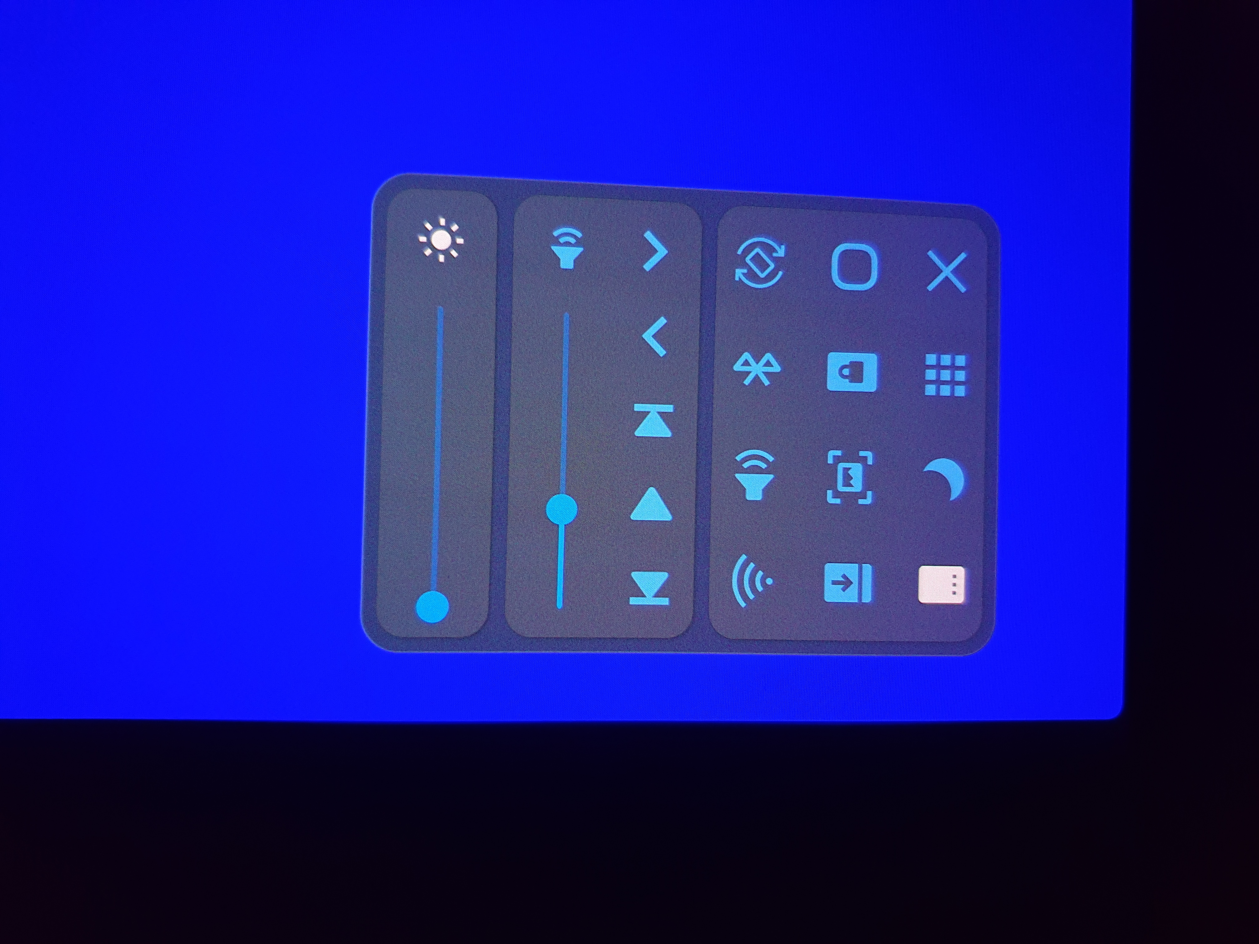
In addition to this, we have "anywhere actions". These are additional gestures that are captured by the system rather than by the current app, and are used for global shortcuts. You can see my current ones at the top of the first image below. I attached the magnifier to one of the gestures, and the translator to another. Smart Select and Screen Write came already bound to their pictured gestures, and are very useful screenshotting tools. You can even use Smart Select to capture an animated GIF of a section of your screen, which is pretty cool. I can also hold my pen button to open OneNote, and all of these gestures can be rebound to a multitude of apps and device functions. Any app can be opened, or any of the Samsung utilities, such as Glance.
Another gesture is that you can hold the pen button and double click the pen onto the display, and Samsung Notes will open in a window with a fresh note. You can use this to very quickly write something down, from anywhere in the system, without losing what you are currently doing. You can take that window and split screen it, move it around the screen, or make it transparent - whatever you fancy. This is a great shortcut, but if you want to change it, you will need to download the new Pentastic Good Lock module. In there, you can bind it to any option available with the other gestures. Pentastic also permits customisation of the Air Command menu itself, the pointer, and the sounds played when the pen is attached to or deatched from the device.
Air Actions.
Camera Shortcuts.
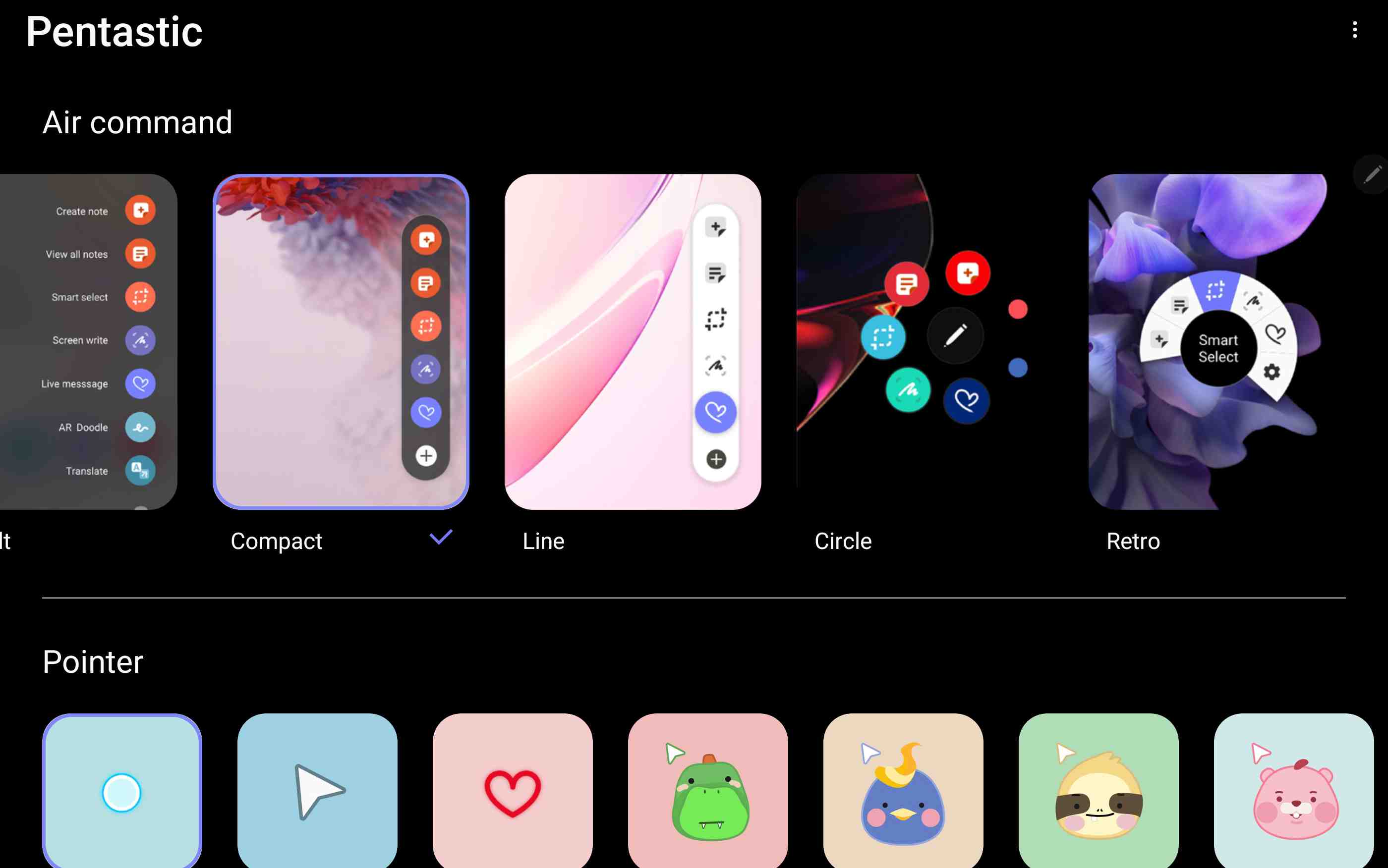
Pentastic, showing the styles for the Air Command menu and the pointer.
Note Taking
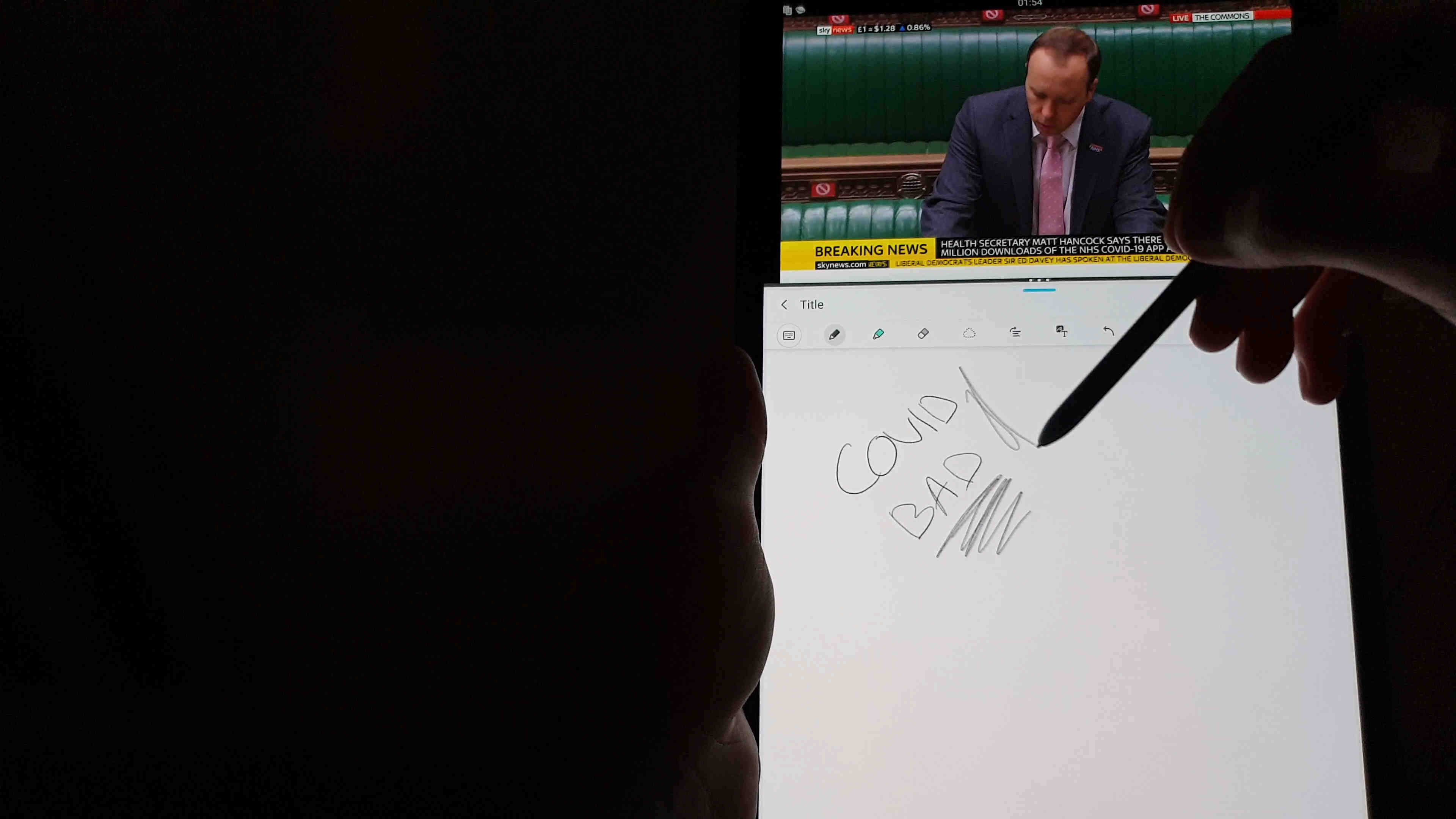
Note taking is a primary use case for me, and there are two apps I use - OneNote, and Samsung Notes. I've been asked about Google Keep. I tried it, and the app is clearly not designed for pen users. There is no pressure sensitivity, and you cannot disable "finger painting", where your finger acts as a pen. Google designed the app's pen functionality around people using finger-emulating pens with thick nibs and poor accuracy - not around precision equipment like an S-Pen. I cannot recommend using it. In this section I will include a brief overview of the two note taking apps I recommend using - Samsung Notes and OneNote. Please see the end of the video review for a demonstration of Samsung Notes.
Samsung Notes
Samsung Notes has long been a strange app - it has been through some phases. Previously, Samsung's note taking app was called S Note, and it was a good app. For some reason, they replaced it with Samsung Notes when they launched the Galaxy Note 7 - which was four years ago. S Note allowed you to organize your notes into their own notebooks, it had a full AMOLED dark mode, and worked really well. When Samsung Notes came out, it butchered the dark mode; only permitting you to type onto a white background. You could set a black background for your ink, but it just appeared as a black box on a white background - there were still white margins on all sides. It didn't make much sense. Worse still, the screen off memos (which do work on tablets) supported a full dark mode; yet absurdly, they would not support that once saved.
With the release of the Tab S7 and Note 20 series, four years on, Samsung Notes has been updated to version 4, and has finally reached a point that is ahead of S Note. The full AMOLED dark mode is back. Samsung Notes is now our built-in PDF reader and editor, and the pen latency is astonishing. We can finally ink and type into the same areas, laying one onto the other, unlike previous versions of Samsung Notes which mandated that ink be separate to typed text. In November, it will sync with OneNote (according to Microsoft).
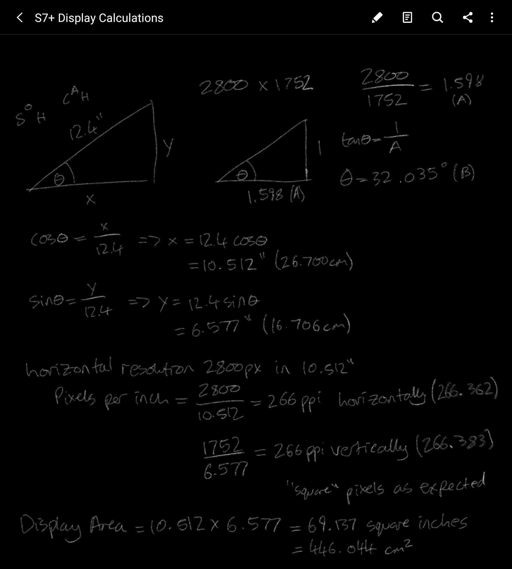
I'll go through some of the things you can do in the app. See the first image below for our starting point. It is a note I made to calculate the display area of this tablet - the result is 446cm^2, or just over 69 square inches. We are currently in Reading mode - the first icon in the toolbar puts us into Edit mode. The second icon is "sort pages", and this opens up a side panel where we can manually add, remove, and re-order pages. We re-order pages by dragging them, and we delete by clicking the three dots in the lower right corner of each page - there is no multi select for this. We can also add pages automatically by scrolling down within the note (the app settings also have an infinite canvas option). You bookmark a page by clicking the bookmark icon at the top of that page, and we access our bookmarks through the bookmark icon at the top of this side panel.
We can also search pages using the search icon at the top of this panel, or the one in the third position on the toolbar. This search will scan for typed text, as well as inked (hand written) text, and text within images. It seems to work quite well - see an example in the third image below, where I search for words that I inked.
Samsung Notes - inside a note.
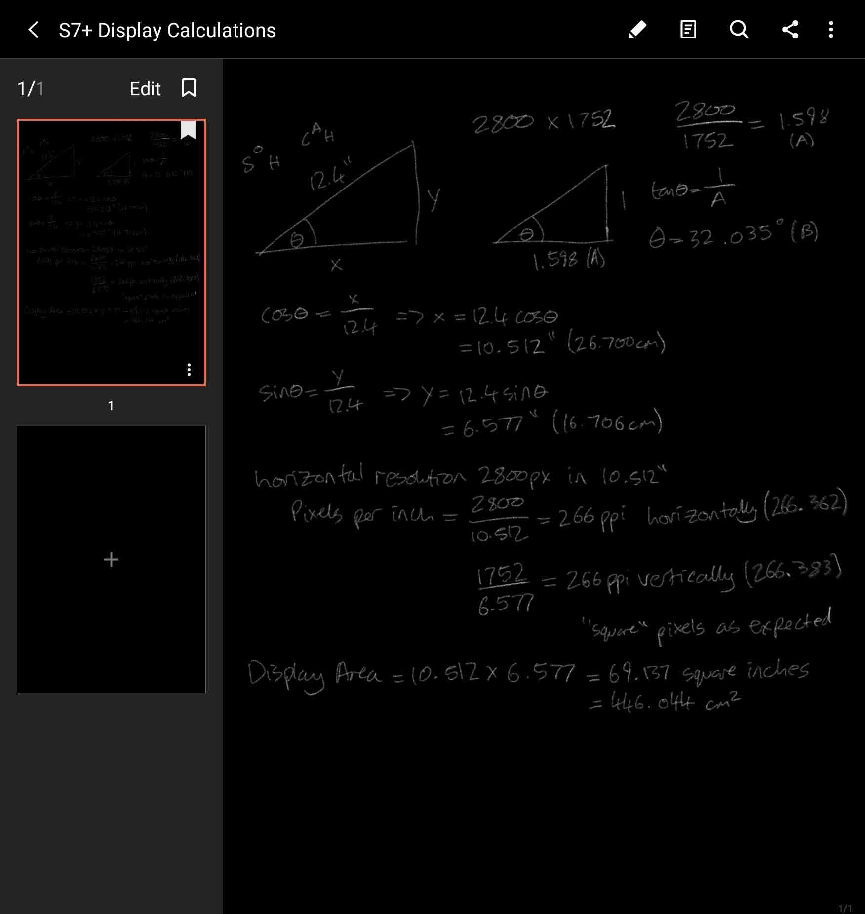
Samsung Notes - Sort Pages.
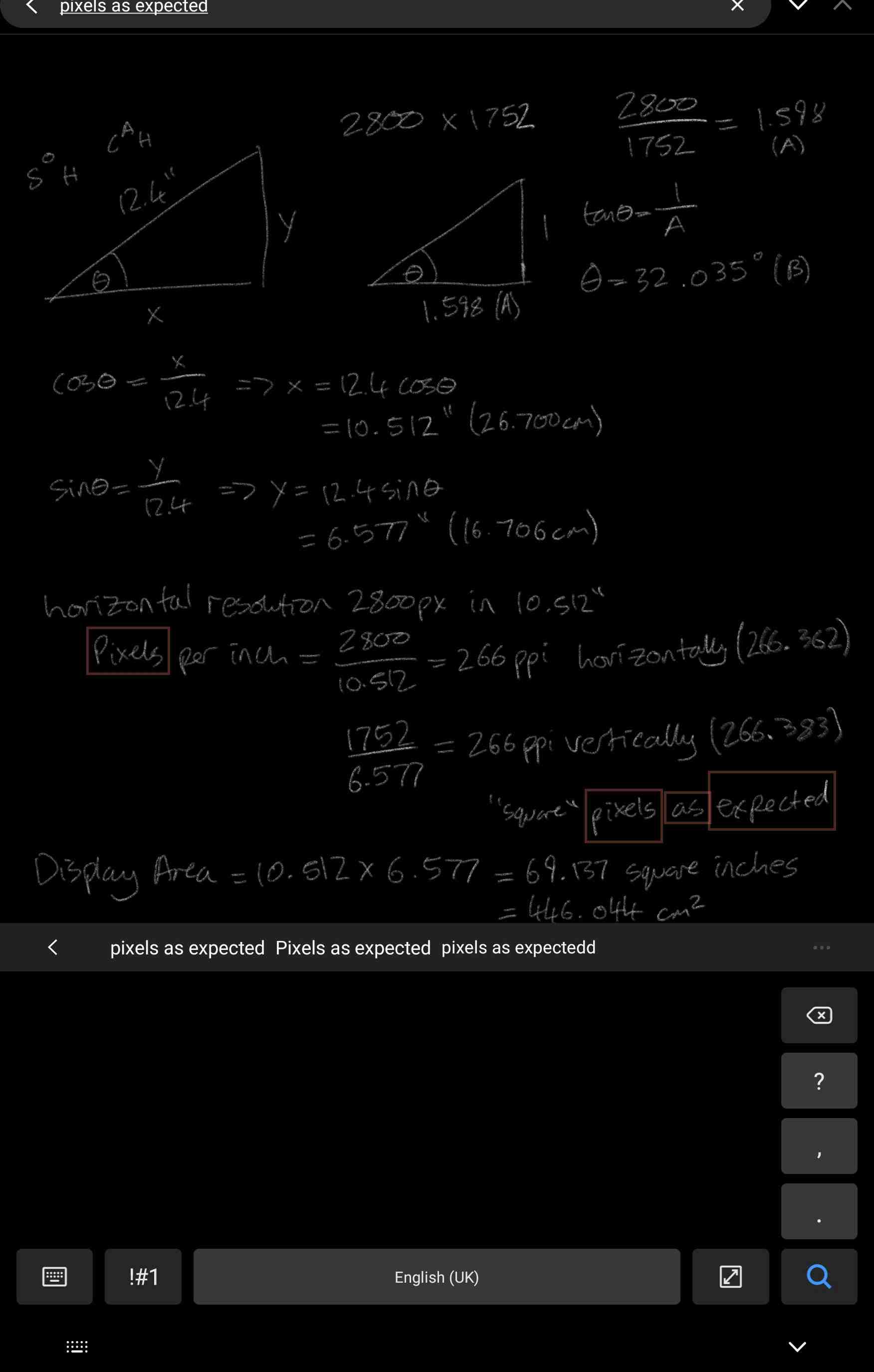
Samsung Notes - Searching hand-written, or inked, text.
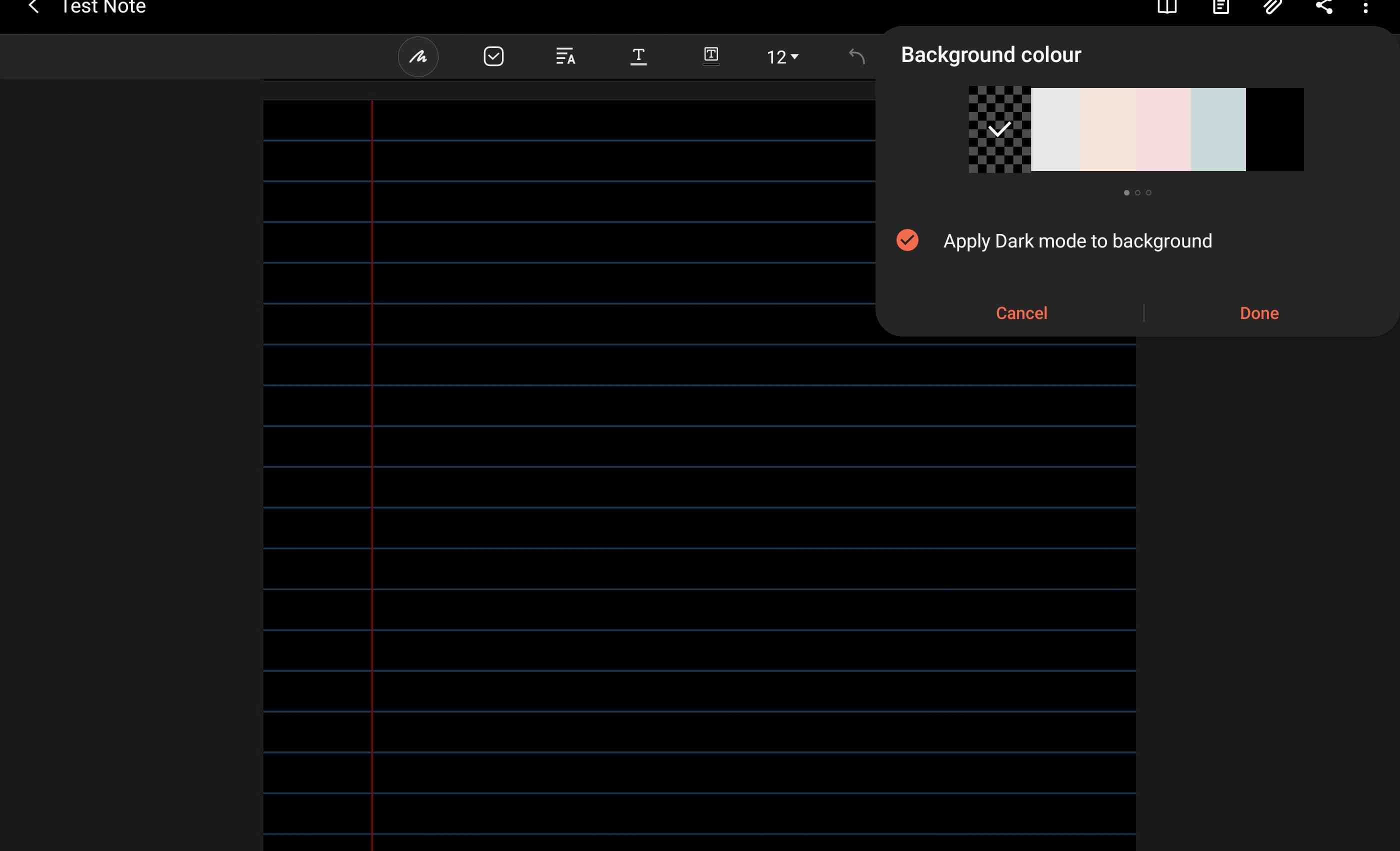
Samsung Notes page background colours.
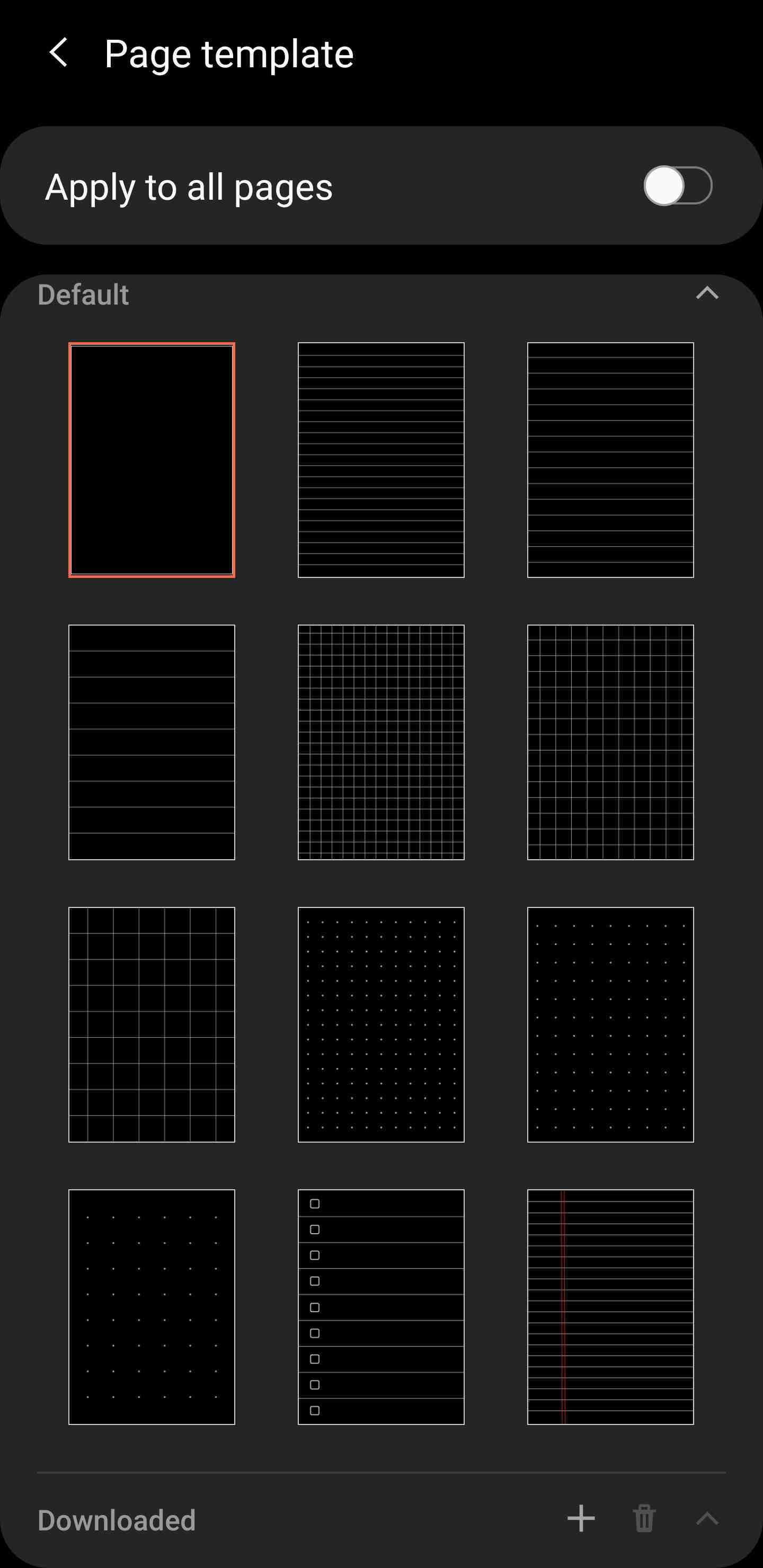
Samsung Notes Page Templates.
The background colour and template can be set independently for each page. There are three pages of pre-defined colours to scroll through, including black, but you cannot set a custom colour right now; at least not through this dialog. A template is something that adds rule lines, grid lines, e.t.c. to that page. On the second row above, the first image shows the included templates. You have several lined and gridded options, also including a checkbox template. You can also add in your own custom templates, or those shared by others.
I wanted to make templates that would precisely match my requirements, so I marked them up in Photoshop and exported to PNG, and then imported them into Samsung Notes. I used my preferred colours with a transparent background, although the transparency is not respected and is treated as a black background. If you would like to make your own templates with custom styles and colours, just remember to keep an aspect ratio of 1.3 recurring and to make it in portrait, and then it will fit the page exactly. Anything else will scale to fit the page width, and will leave blank spaces on the top and bottom. As an example, you could make a Photoshop document with width 2000 and height 2666.
What if you want to have multiple notes open at once? You can do that. Just drag the app in from the Apps Edge and split the screen or open a new window, and each one will have a fresh instance of the app. I've not used more than three instances myself, but I'm not aware of any hard limit. I expect you can open as many instances as you need, considering memory constraints.
Like the Windows version of OneNote, you can record audio and it will track your note taking as the recording progresses. When you fall back to reading mode and play that recording, you can see the progression of your note in time with the recording. If you seek the recorded audio, the page will scroll to show what you were doing at that point in the timeline. Recordings can be paused and resumed as needed during note taking.
There are some annoyances with the app, or just things to be aware of. For example, the page always zooms to 120% whenever you enter landscape - I would like for it to just stay at 100% zoom, but this is not configurable. If you use the transparent page background option with dark mode applied to it, and then you export as PDF, it will export in light mode - the text will be black and the background will be white. This can be a convenient way to work in dark mode and produce a light mode output, if that is your requirement. If you want to keep everything dark always, then you should select a black background and not use the applied dark mode. The app also has some temperamental issues with the toolbar in split screen, where items may not be clickable. I'm sure they will fix this one.
As far as note taking apps go, I think that Samsung Notes is an absolute top contender now. I would rate it joint best alongside the Windows version of OneNote; where Samsung Notes has a better inking experience, but OneNote for Windows has a couple of extra tools, like the "add space" and "ruler" tools, and broader platform support.
Please see the end of the video review if you would like to see Samsung Notes in action. It has some pretty nice sound effects as you write.
OneNote
I think that most users will prefer Samsung Notes, but OneNote is still my primary note taking application. The reason for this is primarily platform support, as OneNote works everywhere. Most platforms have a native app, and if it doesn't, you can use the website. Organization is very good, supporting notebooks with sections and sub-sections. Search is excellent, able to search through all of your notes. Most importantly for me, I have a long history of notes already in there. Pretty much everything I learnt in my Physics degree is in OneNote, and everything I've learnt since. Moving away from that is not easy, and I don't feel a need to. If you are starting fresh, and if you do not need your notes on a desktop, then Samsung Notes could be a great fit for you.
OneNote for Android is the weakest version of OneNote. It's not bad, but it's not as good as the Windows versions, which are the best. The app supports a pretty decent dark mode and has done for a while - backgrounds are either grey or white, and you cannot customise this, so there's no black. You get one template each for ruled and gridded paper, and all pages scroll infinitely, both horizontally and vertically. The ink keeps up pretty well, and it performs better than most pen apps in terms of ink smoothness, latency and composition; just not as well as Samsung Notes. When I say composition, I mean that the ink looks clean - Noteshelf, for instance, seems to write with a series of circular blobs that does not appear natural. The app does have a temperamental ink shifting issue, where ink will sometimes move slightly after lifting the pen, but it's not deal breaking. The ink is plenty responsive to give it a good feel, even if Samsung Notes is the clear leader for that. The app only offers basic pens, and on Windows I would use the pencil, but we do not have that on Android. We have highlighters and erasers, and a lasso to move things around.
The Windows version, and even the iOS version, have the "add space" tool. This one is very useful and would be my primary feature request. It allows you to insert space by dragging the page down, so that you can add more space to the middle of your notes. The tool also supports removing space, but we do not have it on Android. Speaking of Windows, you can work on a single note from multiple devices at the same time. I often take screenshots from my desktop and add them to my note there, and then continue writing on my tablet, and it never takes more than a few seconds at most to sync up.
On Android, images can be glitchy. Sometimes when I try to move an image, it does not move as expected - it may move in the wrong direction when dragged, but other times it is fine. I find myself moving images on Windows to circumvent this issue. Sync works great, as does the app lifetime - it can stay loaded into memory overnight, just like Samsung Notes.
I had hoped that the Surface Duo would release with a OneNote update to add in some of the missing features from the Windows version, but still we wait.
Gestures and Multi-Tasking
A Brief Overview of Good Lock
This section will be mainly about Good Lock. Good Lock is a Samsung app that you download through Galaxy Apps to add cutting edge features to your device. If you think that Good Lock is a strange name for this app, just remember that the developers are Korean. The English translations are not always perfect, but the functionality is very good.
Good Lock works with a module system. First, you download Good Lock, and then within Good Lock you will see the available modules. Each module links you to the Galaxy Apps store to install it into Good Lock, and then you can access that module within Good Lock. You can get modules to customize the home screen. Would you like to have more icons in a row or column, or less? The Home Up module is your friend. Would you like to change the sound effect used when the pen is attached to or detached from the device, change the look of Air Command, or customize the double tap pen gesture? Get the Pentastic module. What about Lock Screen customization? LockStar (currently only works in portrait). Gestures? One Hand Operation+, MultiStar and Task Changer. Want a global equalizer? Want to direct sound from different apps to different output devices? Want to individually balance the volume from different apps, or mute specific apps entirely? SoundAssistant.
Good Lock is a system selling application suite, so be sure to check out Good Lock and all of the modules in there. In this section, I will go over my personal favourite modules and how you can use them.
One Hand Operation+
I'm not going to discuss the Android 10 gestures. Google has pretty much done what they always do, which is to copy Apple as closely as possible. They added a gesture bar to the bottom of the display, which is an awful place to gesture from. If you're holding a phone, your thumb is naturally going to rest around the side of the display, and it's the same holding a tablet. Samsung recognized this a few years ago and added in their own Edge gesture suite called One Hand Operation+. This is a part of the Good Lock family of apps, and one of my favourite apps on my Samsung devices. It has made my experience so much better than with the horrendous systems Google has copied from Apple.
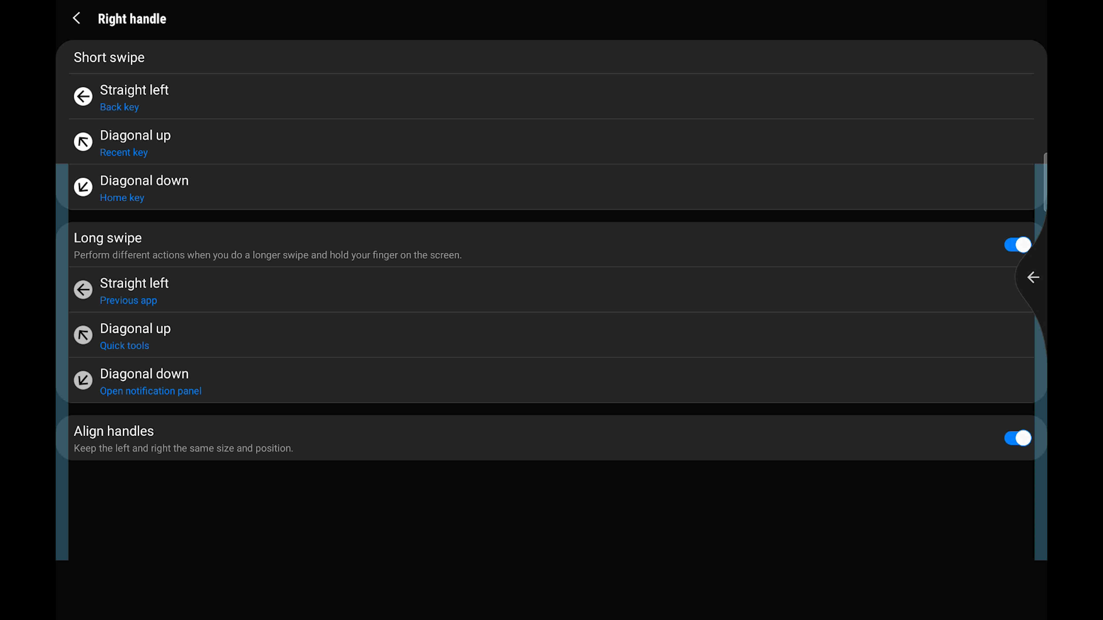
To access One Hand Operation+, first download Good Lock from the Galaxy Apps store, and then within Good Lock you can find the One Hand Operation+ module. Install it, and you will have six configurable gestures on each the left and right edge of the device. From the Edge, you can swipe horizontally, or diagonally up or diagonally down; you can do a quick swipe or a long swipe, totalling twelve gestures. All of these gestures begin from an area where your thumb is naturally resting, making them effortless to perform. With large phones, this makes one handed use much, much easier; and with large tablets, you can more conveniently gesture your way through the system. There's no need to go out of your way to the bottom gesture bar, as you would on a Google or Apple device.
One gesture I use is a short horizontal swipe to go back. I felt this was a natural one to bind, and apparently so did Google - they took that gesture, even so far as to copy the default icon, straight out of One Hand Operation+ and made it a built in gesture. Using One Hand Operation+ will disable that built in gesture, and you can bind it to whatever you like, as well as binding the diagonal and long swipes. Here are the gestures I use with my Tab:
- Horizontal: Back
- Horizontal Long: Switch to previous app
- Diagonal Up: Open Recents
- Diagonal Up Long: Open Quick Tools
- Diagonal Down: Home
- Diagonal Down Long: Open Notifications Panel
I have the same gestures set to both sides, but you can make them different if you like, and there are other actions to choose from. You can open a specific app, turn off the screen, or do plenty of other things. To activate these gestures, you need to begin swiping from the designated areas on either side of the device. These areas are configurable - I have them cover most of the side, and I choose to hide the gesture handles, but you can make them visible if you wish.
When Apple implemented a bottom gesture bar and Google copied it, I don't think either of them thought through the way that people actually use and hold their devices. Samsung did, and it really shows. This app is a massive usability improvement for me.
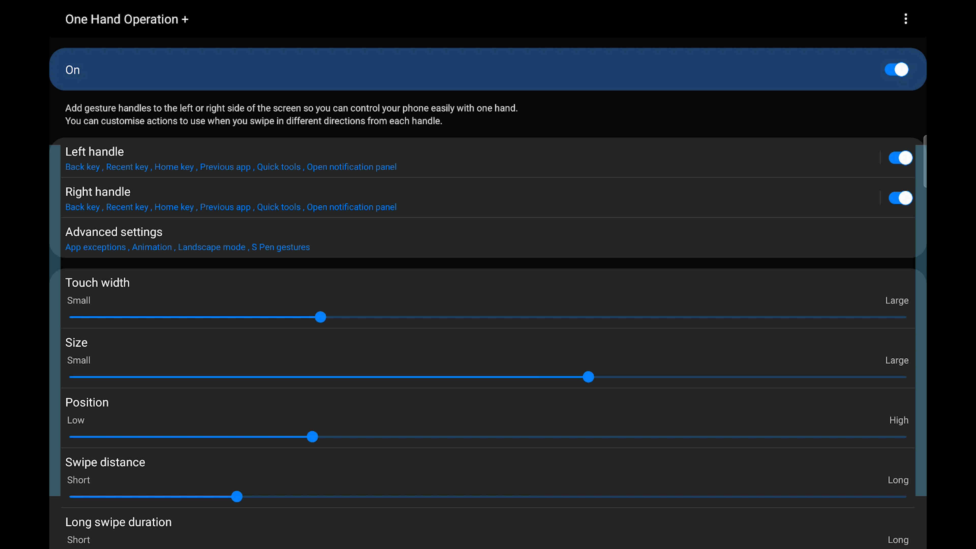
The OHO+ Main Menu.
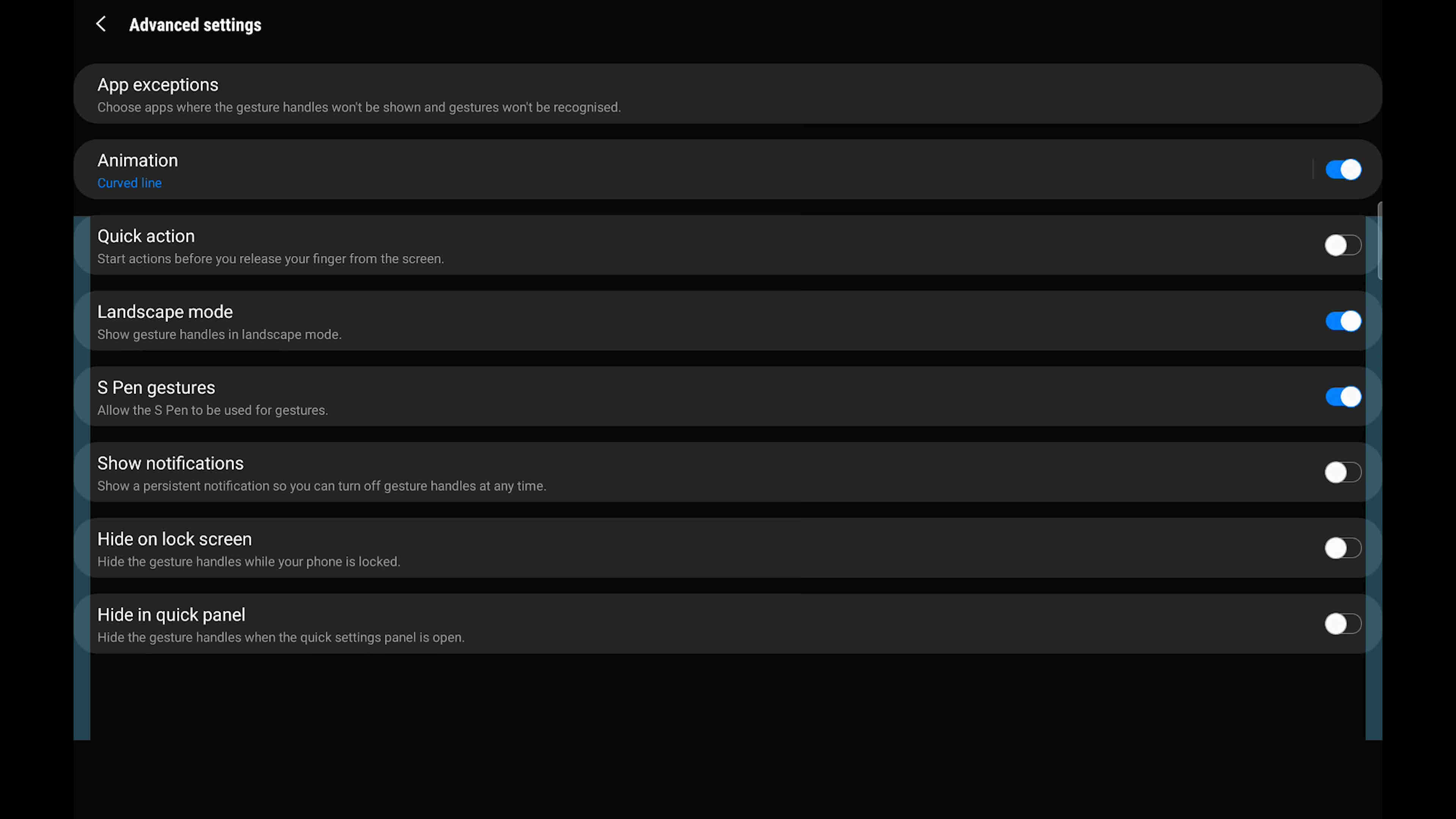
OHO+ Advanced Settings.
OHO+ Gestures.
Task Changer, MultiStar, and the Multi Tasking Experience
Two of my other favourites from the Good Lock suite are Task Changer and MultiStar, which enhance the multi window and window snapping experience. In stock Android, to open an app in split screen, you have to go to the Recents and click the app icon, then click "split screen" from a drop-down list. Not very good.
With Samsung devices, we have two options. One of them is the Apps Edge. We can pull this panel open, and drag an app from it onto the screen. If we drag it to the left, top, right or bottom side of the device, it will open on that side as a split screen app. Once you have two apps sharing the screen, you can drag again to split a third time (only the top or right side app can be split again). If we drag it to the center of the display, the app will open in a window. Regardless of how many apps we have split the screen with, we can always open more windows.
What if the app is already open? The Task Changer module enables almost the same behaviour for the Recents menu. Simply open the Recents menu, and drag an app in the same way to split the screen or window it. There is one slight issue with this functionality at the moment, which is that using this method, the app will open on the opposite side of the screen to where it is placed. I am sure this will be fixed via an update in the near future. This interface also does not support a third split yet.
As I am writing this, the Task Changer app has been updated (17th September). The app will no longer open on the wrong side, but now you can only open it on the right hand side, and you can no longer drag to the center to window the app. You can, however, now add a third split through the Task Changer interface. I hope they can get both sides of this working again.
Another update - Task Changer no longer enables you to drag to the sides to split the screen in the Recents menu, only allowing you to drag to a window zone. I think this will settle down at some point and the functionality should all come back. For now, you can only drag to split from the Apps Edge. I think they are struggling with the drag zones across differently sized devices. Task Changer is not usually so temperamental with its features.
There are two experiences at play here. One is built in through the Apps Edge menu, and the other is from Good Lock modules. What happens is that over time, cutting-edge functionality from Good Lock should be integrated into Samsung's Android distribution (One UI). Until then, we access this additional functionality by installing Good Lock, and then we continue to access the next stuff through Good Lock. As Good Lock is bringing us cutting edge features, there are things we can do through the Good Lock snapping interface that cannot be done through the Apps Edge interface, and potentially vice versa. For example, MultiStar has an option titled "keeping pop-up view last used". The translation is difficult to understand, but this means that when you window an app by dragging it to the display center, the position and size of the app will be remembered from when you last used that specific app in a window, but only if you window it through the Recents menu. In the future, we should expect this functionality to be built in and to cover the Apps Edge also.
In stock Android, not all apps can be windowed or opened in split screen. Using MultiStar, you can tick the option to "Enable multi window to all apps", which fixes this. That's very useful. There's an option called "Pop-up view action", which means you can swipe diagonally down from one of the top corners whilst in a fullscreen app to window it. The Good Lock suite is packed with great functionality like this. With windows, you can move and size them as you wish, and open as many as you can fit. You can adjust their transparency, so that you can note take over a fullscreen video. You can transition them to split screen. You can minimize them into "floating heads" and then open them back up later.
Additionally, some Android apps force portrait mode. I don't actually use any of the offending apps, but I downloaded the official Reddit app, which does do this, so that I could test it out. When you open the app in landscape, it force rotates back to portrait. There are two ways you can solve this on Galaxy devices. One is to window the app, and then it will fill the window, even in landscape. Another is with a new feature added to MultiStar. At the top of MultiStar, there is a new section called "I ❤ Galaxy Tablet". In here, there's an option to use your keyboard as input for another Galaxy device, wirelessly, and the reason we are here - which is "Rotate with our best". This setting forces portrait apps to be landscape compatible. With this option enabled, the Reddit app can open in landscape. This solves one of the criticisms that some people have against the Android tablet experience. The setting comes with a disclaimer that it may not always work, but as with enabling multi window for all apps, I doubt there is a single app that does not work with it.
There's a lot to digest here, but people who enjoy the multi window experience will find a lot of value in these apps. The video review contains a multi tasking demonstration, but here are some screenshots from it.
Horizontal multi tasking with two apps.
Horizontal multi tasking with three apps - all apps can be resized or swiped away.
Vertical multi tasking with two apps. We can add a third to the top. Clicking the divider reveals a button to switch to horizontal multi tasking.
A windowed scientific calculator. These apps don't make sense in full screen and often don't make sense in split screen either. This is a very convenient way to use such an app.

When playing a video in Samsung Internet, the Video Assistant offers to open the video. If we then tab out, we get a movable player throughout the OS. This is currently bugged as it drops the display's refresh rate, but otherwise functions.
We can open a window of Samsung Notes over a fullscreen video, and even get a transparent on-screen keyboard when using it, so that the video is minimally obstructed.
We can even ink onto this window, whilst the video is playing.
This is another good way to note take whilst watching a video.
Performance
Unlike with laptops and Windows tablets, I don't read as far into performance specifications with mobile-class tablets. This device uses the Snapdragon 865+ processor, which is the best one available to Samsung. They could have done what they do with phones and used an inferior Exynos processor in many parts of the world, but thankfully they have not.
I said that it is the best processor available to them, but in the mobile tablet space, the best at the moment would be an Apple A12Z, which is used in the iPad Pro devices. This processor is not available to Samsung. It is entirely true that the A12Z is better, in terms of being more powerful overall, both in graphics and CPU tasks. I do think it is Samsung's responsibility to better compete with this, but it's not really an issue. A lot of people are talking about Xbox game streaming these days, and the only thing you need to consume that on this device is a half-decent video decode chip, and a good wifi chip, both of which the device has. Additionally, you need a low latency internet connection and to live close to Microsoft's source datacenter. For all the extra processing power that the iPad Pro has, it cannot stream Xbox games, as Apple will not permit it. That leaves the question of, what does CPU and GPU performance actually count for?
Performance is important and I will get to some metrics, but I think there is more to mobile tablets than raw performance. One of my use cases is as a "thin client", where my tablet allows me to remote into my desktop. Doing this, I can get near enough a laptop class experience out of this tablet. For this use case, the power of my tablet is not important, as I am using the power of my PC. Xbox game streaming is another example of a thin client, where the tablet is essentially just a display and some input for software that is running on another machine. It is the power of that other machine that matters.
The thin client experience is not all that matters. If you get one of these tablets, I expect you will run a bunch of software directly on it, and in that software you will want a smooth and responsive experience. You will want the GPU to be powerful enough to render your apps at 120FPS, to saturate your 120Hz display. You want apps to open quickly and scroll smoothly, and all of this is achieved with the 865+. Processor performance is a non-issue. That said, if Apple provides more processing power in their tablets, then we would be right to ask Samsung why they cannot do the same. Samsung is in fact working on this, but we will not see any results of their efforts until 2022 in new processors.
Whilst writing this, it was announced that Nvidia will buy out ARM. With this new development, I expect we will see much improved ARM reference designs in a few year's time which should boost the Android ecosystem when it comes to device performance. The reason Apple processors perform better is because their CPU designs are better than the ARM reference, but with Nvidia taking over, I would not expect that to contiune being the case for much longer. At worst, Nvidia will match them in CPU, and absolutely surpass them on the integrated GPU side. Of Nvidia's graphics superiority, there is no question. This is my prediction.
If you know that there is a use case where the iPad Pro offers more performance that you need, then perhaps you should choose an iPad Pro. If you cannot think of a use case, then I do not recommend factoring this into your purchasing decision.
I also want to address memory, specifically the capacities. Memory, or RAM, is in lower capacities than it should be on these tablets. Whilst Samsung is releasing phones with 12GB of memory, they are releasing their top tablets with 6 and 8GB. Worse for me, the 8GB variants are not being offered in the UK. I would have purchased an 8GB variant if I could have, but what I got was a 6GB. This is not a deal-breaking issue for me, but it does not feel very future proof. It will probably be fine, but 8GB should have been the minimum, rather than the maximum.
The primary effects of increased memory capacity should be to keep more applications loaded into that memory at any given time, and also to run applications that require larger amounts of memory. Android is, in my view, quite poor with memory management. I see the same thing with this 6GB tablet that I see with my 6GB phone - memory usage never goes above 4.1GB, yet apps do sometimes get unloaded from memory. There is no good reason for this occurring whilst there is available memory. Windows is very good with memory management and Android is really the opposite end of that. Sometimes apps stay loaded in memory, and sometimes they don't. Android needs improvement in this area. As a side note here, the MultiStar module for Good Lock does permit you to prevent one marked application from being unloaded, but only one.
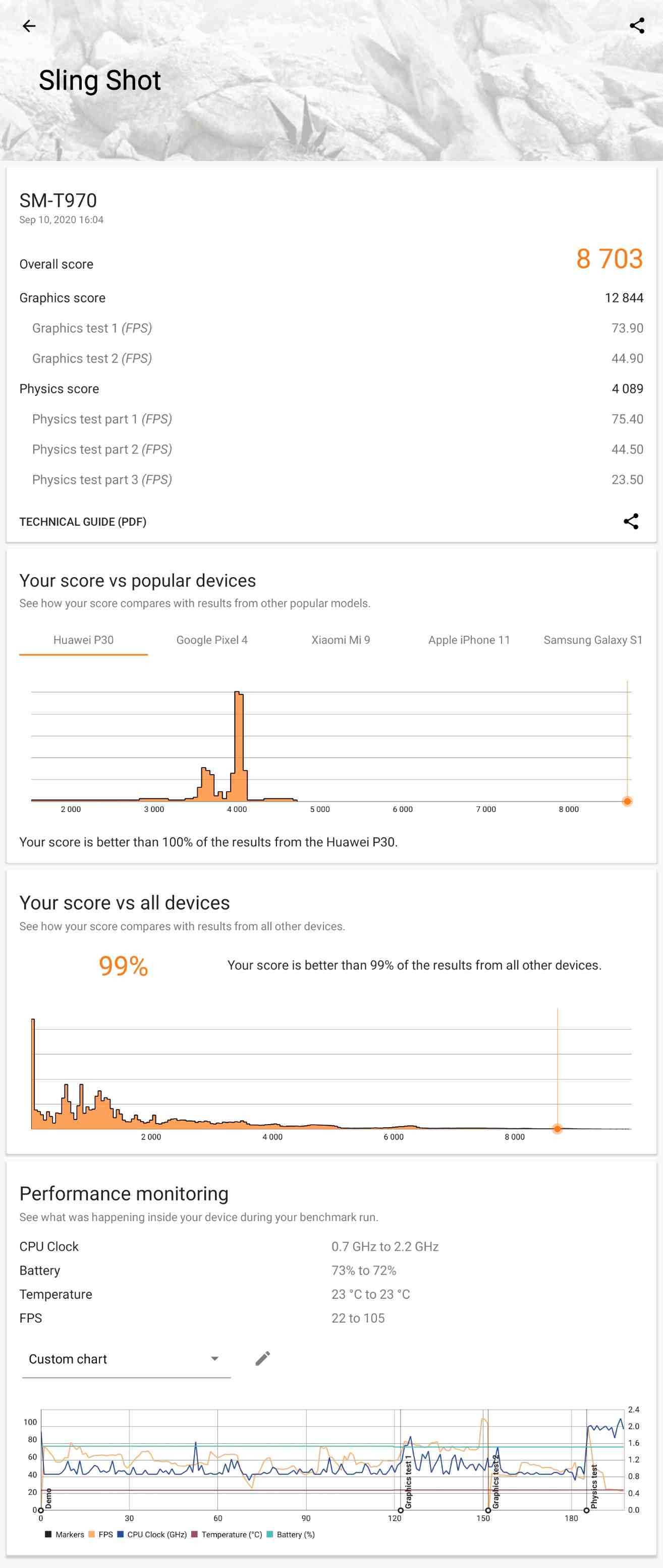
Slingshot Result.
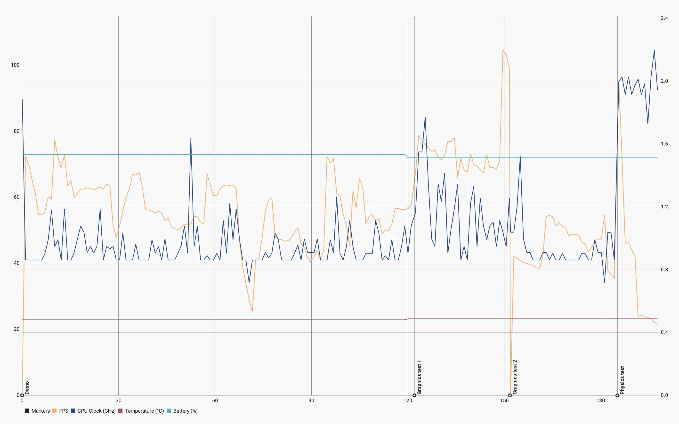
Slingshot Graph.
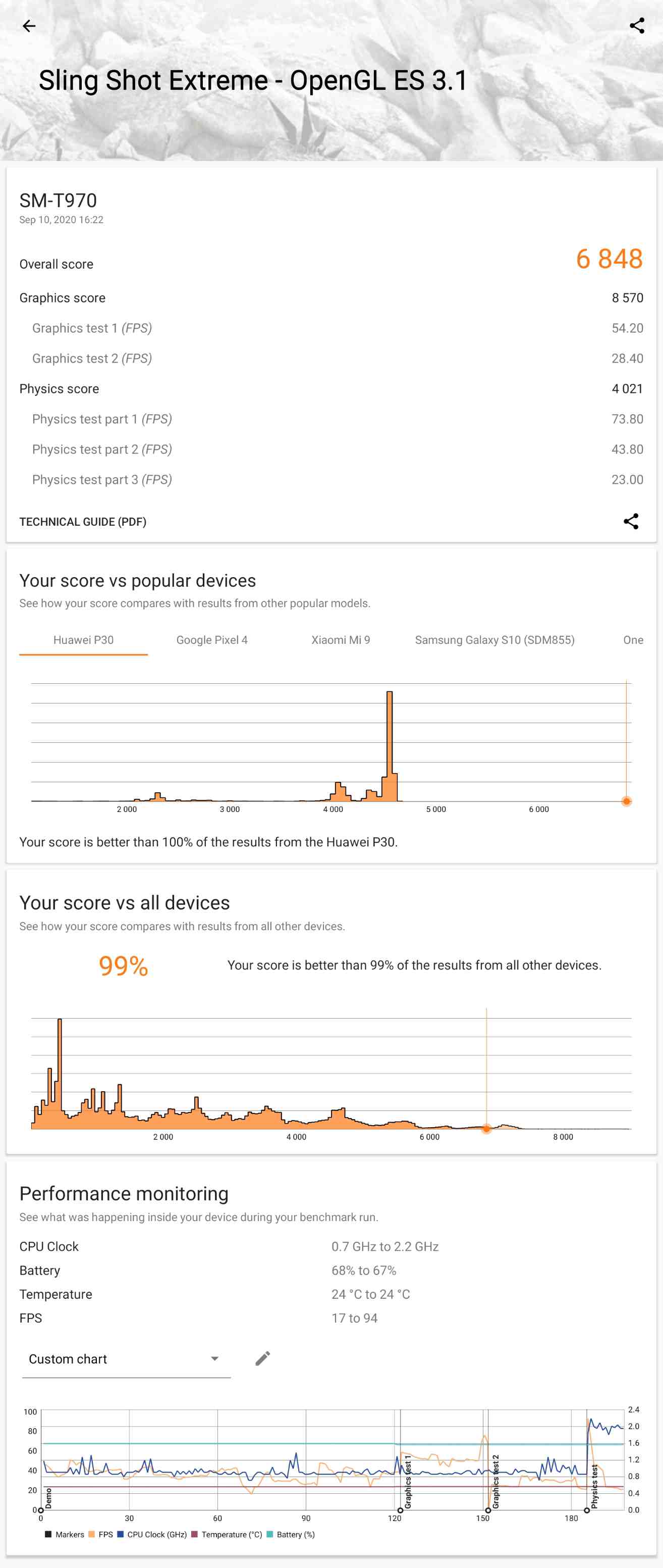
Slingshot Extreme OpenGL Result.
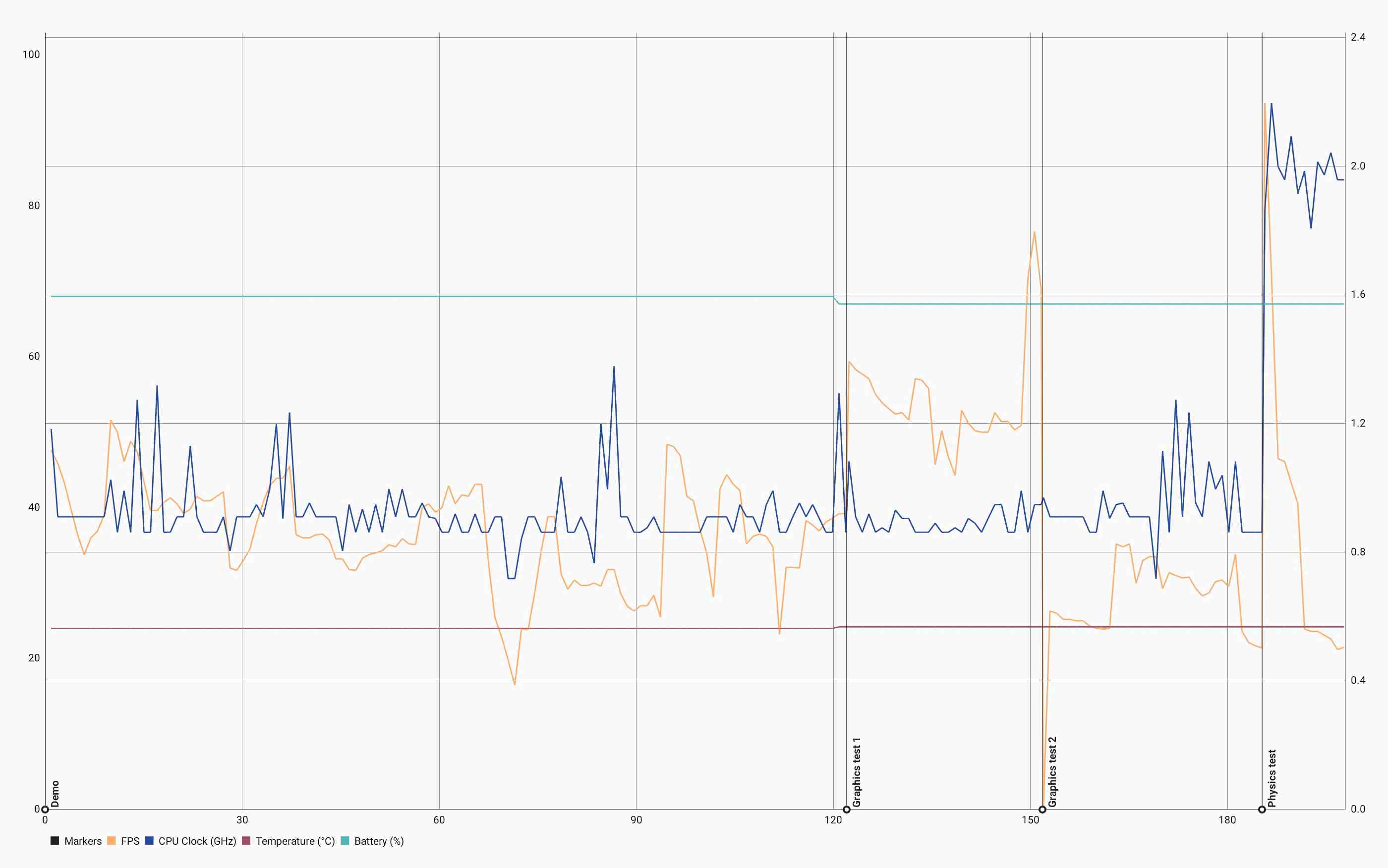
Slingshot Extreme OpenGL Graph.
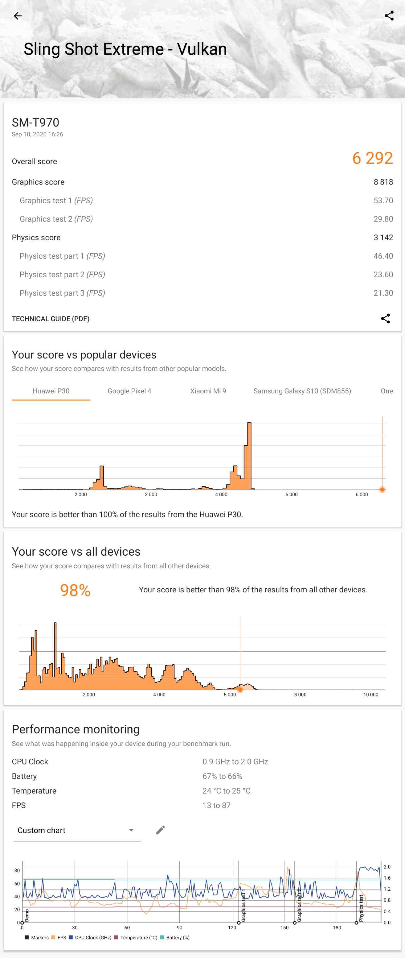
Slingshot Extreme Vulkan Result.
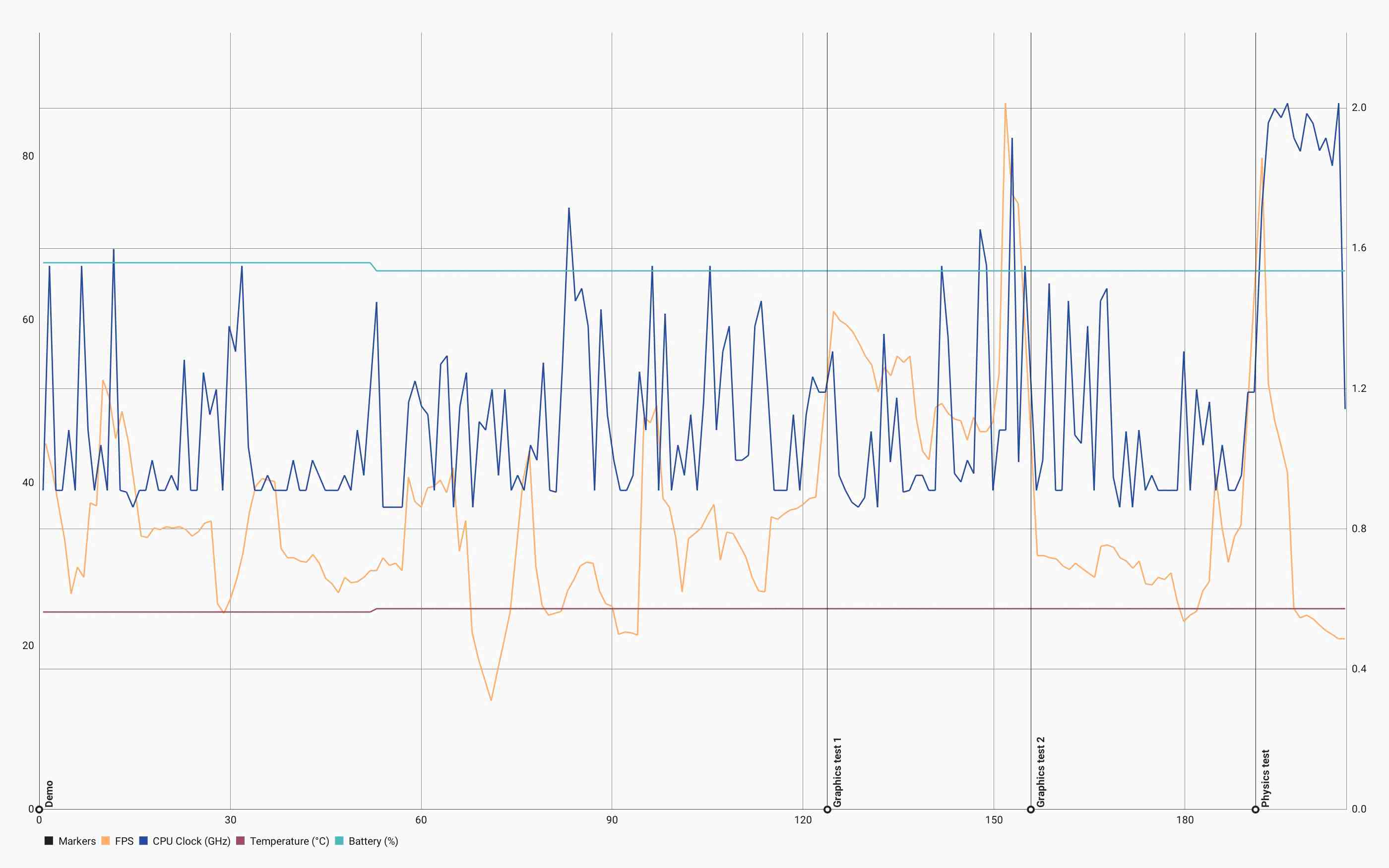
Slingshot Extreme Vulkan Graph.
My experience with performance testing on Android is more limited than Windows, but I turned to 3DMark for my first tests. The 3DMark suite on Android is limited and the same tests do not exist on Windows, but Slingshot and Slingshot Extreme should provide good performance metrics. Geekbench is a common benchmark, but I do not see the significance of its benchmark results, and for this reason I have not tested it. 3DMark benchmarks have clear direction and meaning that I feel does not exist with Geekbench - what does a Geekbench score really mean? This is not as clear as with 3DMark's results.
Battery
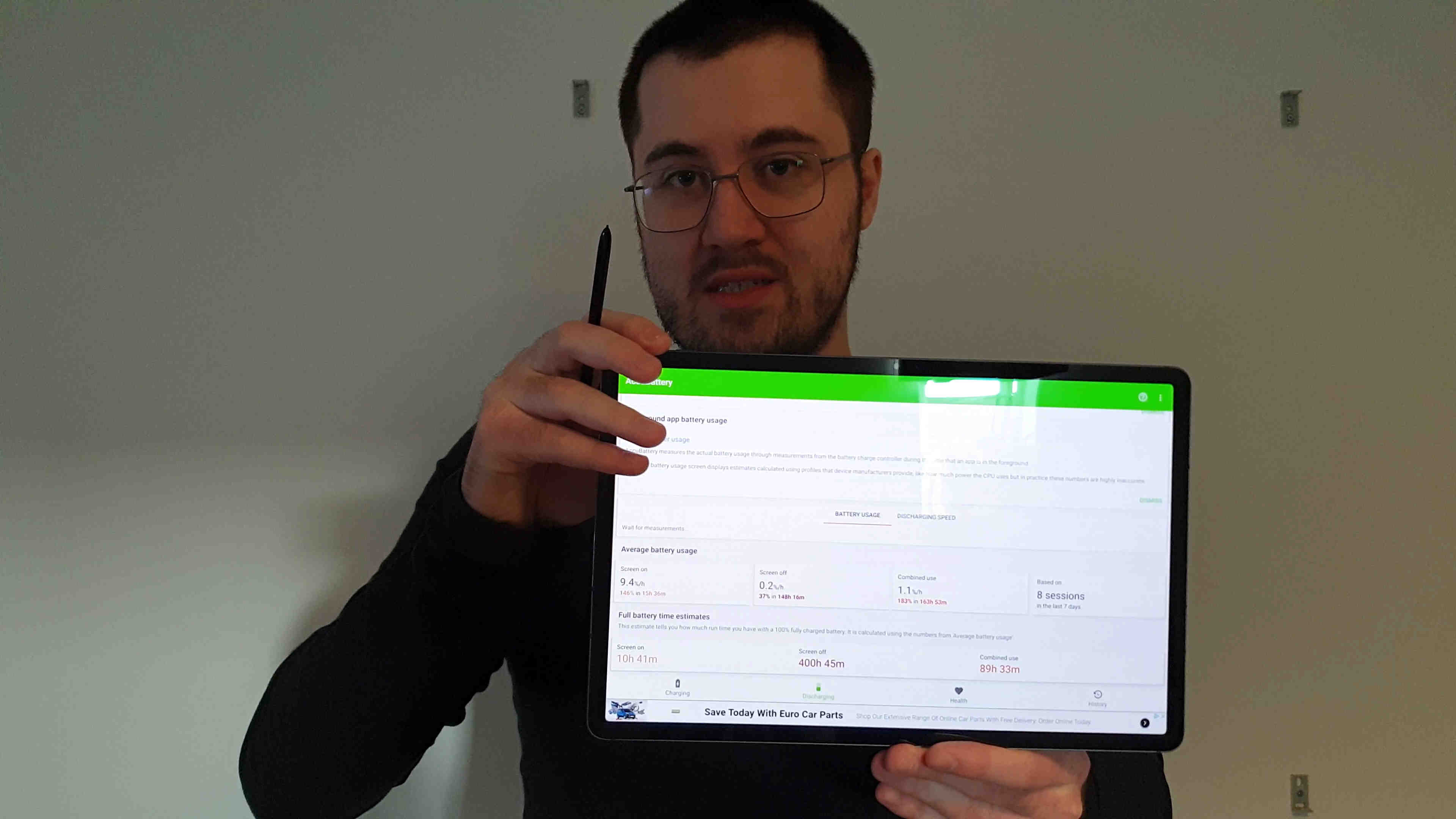
The battery is 10Ah, or 10,090 mAh as they write it. This is very similar to a Surface Pro, but on this device you can expect at least double the battery life of a Surface Pro. I've used AccuBattery for one month and it reports that I can achieve almost 11 hours of screen on time, which is great. I do use the device primarily in dark mode and usually at lower brightness, and this will go down if you use the device with light themes.
Additionally, I watched some TV shows in the Samsung Video app at 25% brightness and projected 12 to 12.5 hours of battery life for purely watching videos. Expect less battery life doing other work - playing back local video files is pretty much the most efficient use case for any device these days.
AccuBattery.
Keyboard and Kickstand (Keyboard Cover)
Keyboard and Touchpad
For the S7+, the keyboard cover, which includes both a keyboard and separate kickstand, costs £220. Pretty expensive. It magnetically attaches to the bottom edge of the tablet, much like a Surface keyboard. The keyboard is pretty much full size, and as someone used to desktop class keyboards, I got up to full typing speed instantaneously. I like the feel of the keys. I think the spacing is very good, as is the key travel - for a laptop keyboard. Out of the box, it supports Ctrl+Arrows to jump over words, Ctrl+Shift+Arrows to select words, and Shift+Arrows to select letters. I use these a lot on Windows. This has made me very productive when typing with the keyboard, in the applications that support it. You cannot use Ctrl to jump words in OneNote, but it works in Samsung Internet and Samsung Notes.
I would like to Win+E for the file explorer, but that is bound to the default email app. You can use Ctrl+B to open a web browser, but you can only choose between Samsung Internet and Chrome. There are more shortcuts like this, but you have next to no control over them.
On the S7+ keyboard, we have a dedicated function row at the top, which I like. By default, the keys act as F1 through F12. When holding the Fn key, their secondary purpose is activated. From left to right, you first have the Escape key, and then:
- F1: Apps drawer
- F2: Recents
- F3: Home
- F4: Brightness Down
- F5: Brightness Up
- F6: Touchpad Enable/Disable
- F7: Mute
- F8: Volume Down
- F9: Volume Up
- F10: Media Back
- F11: Media Play/Pause
- F12: Media Forward
After the function keys, you have a key for Finder, alternatively opening Settings. You have another to screenshot, alternatively opening DeX. Finally, a Delete key.
The keyboard is not backlit. Even for a touch typist, this is annoying. For me, I only use the backlight on keyboards to re-orient myself when coming back to it, but I still appreciate a backlight. At my desk, I choose to have the backlight on only in the dark, and I do miss not having a backlight on this keyboard. I feel that this is something Samsung could have added without too much trouble.
The touchpad is plastic. At this price point I would expect glass, so making it plastic is a cheap move. Surface keyboards use glass touchpads. The plastic is not as good as it has more resistance, which means your finger not glide quite so smoothly over it. It's not that bad, and I have adjusted to it inside of a day, but it's also not as good as a glass touchpad. Samsung should provide better for this amount of money.
The touchpad clicks in both of the bottom corners and supports some undocumented gestures out of the box. You can of course two finger swipe to scroll. A three finger swipe up opens Recents, and three fingers down goes home. I cannot find any others, so I hope they expand on this, and allow us to rebind the existing keyboard shortcuts whilst they're at it.
You usually cannot use the touchpad to select text as you may expect to with a mouse cursor. Left clicking and dragging will typically not work, but it does work in Samsung Notes. In most apps, you must instead left click and hold on the text, and then the regular text selection handles will appear on screen; as if you had long pressed with a finger. You then drag these with the mouse cursor. It's quite convoluted for a mouse, and that's because it's really a finger, and it works the same way. You also cannot click and drag by double tapping and then dragging, as you would on Windows; you need to use one finger to depress the left click and another to move the cursor. Finally, the cursor has a notable lag and does not keep up that well with the finger. I think this is a software issue that either Samsung or Google has introduced by trying to animate the cursor position.
When you are done typing, you can easily pull off the keyboard, or close it against the display. There are some weak magnets along the top edge of the display that will keep the keyboard closed, but not very well if you close it vertically. If you place the tablet face down with the keyboard closed, and then hold it by the kickstand and lift it, the keyboard will fall open. When closing the keyboard against the display, the display turns off. When you open the keyboard, the display turns back on.
When the keyboard is closed, you will see the outside of it. It's made to look like leather and I do think it looks nice, but the whole thing is some kind of plastic. I really hope this does not wear as poorly as Surface keyboards.
I am very happy with this keyboard from a typing standpoint, it's very comfortable for me and I type quickly with it. It is not so good in the dark as there is no backlight. The touchpad is disappointing. This is a very overpriced keyboard.
Kickstand
Samsung sells both the keyboard and kickstand as one, and does not make them available separately. I take issue with this as it suggests that the kickstand is only necessary when typing, and as a former Surface user, I could not disagree more strongly with that position. In fact, I believe that all large tablets should have kickstands built into them, as they are so useful. Without a kickstand, you are always making a compromise with the display angle. You can never get it just right. You have to hold the tablet when it would be better propped up with the kickstand. The kickstand is just as useful without the keyboard as it is with the keyboard.
The availability of such a kickstand was a mandatory requirement for me purchasing this device. However, due to stock issues, I had the device for 13 days before getting the kickstand, and I was genuinely concerned that the keyboard may not release in the UK. In that time, I decided to keep the tablet even if I could not get the keyboard cover, as I enjoy the tablet so much.
The Tab S6 also had a keyboard cover with a separate kickstand included. It is a common misconception that the S6 kickstand attached magnetically, but from what I have found, it attaches using a suction cup. The magnets were for the pen cover only. Due to attaching with suction, the kickstand was known to fall off the device. People say it is possible to stick the thing onto the S6 and have it stay there, but if you liked to remove it to use the device with less bulk, then it would not stick well again unless cleaned. This looked quite bad to me. I expected Samsung to release a fully magnetic kickstand for the S7 series, and they have.
This kickstand has a large magnetic surface on the back side, which attaches strongly to the tablet. Above this magnetic surface is the pen section, with a recess for the pen and a cutout for the camera. This section easily flips open and is held shut by weaker magnets, but it won't open unless you want it to.
The magnetic attachment for the kickstand is very important, because it means the kickstand can easily be installed or removed at a moment's notice. Some people will keep their tablet covered at all times, but for times where a kickstand is not required, I like to remove it and simply hold the tablet. As the kickstand is an accessory, it adds more bulk and mass to the tablet than if one were built in. By removing it when not in use, you can benefit from how thin and light the tablet is, and the ability to enjoy the tablet in this way is important to me. The S7+ is very pleasant to use as a plain tablet, and you can simply snap on the kickstand whenever you need it. This is an acceptable compromise to not having the kickstand built in
I can hold the open kickstand and shake it over my bed and the tablet does not fall off. It is well attached, and the hinge is very good - surprisingly good. It is very sturdy. The part of the kickstand that kicks out to support the tablet is not that rigid. It can flex a lot when opening it, which is concerning, though I'm not sure if it need be concerning. I would be gentle with it when opening, just due to the way that it flexes. Aside from that, and going back to the hinge, it's very impressive. It seems stronger than my Surface Pro 4's hinge, which is still in pretty good shape as the tablet was never used that much due to faults (please don't buy from Microsoft). I'm not sure if Microsoft has improved that aspect of newer devices. With this, I can actually rest my hand on the display and write with the kickstand holding its angle, as long as I do not rest too hard - you can push it down if you try. I am very impressed by this.
The final thing I appreciate about the keyboard cover is that it covers my display. I was always on edge about the display being left exposed when the device was unattended, so it is nice to have a sturdy cover to keep it safe, particularly on the display side.
So, having seen both components of the keyboard cover, I still think it is overpriced. There are good parts and, unfortunately, bad parts. My primary feedback would be to change the touchpad to glass, fix the touchpad software, and to add backlighting to the keyboard. If they did this, I would feel better about recommending it.
To summarise the kickstand, the hinge is excellent. The stand attaches magnetically and very securely. You can remove it as you please to use the device in a lighter, more handheld configuration. The part that kicks out to support the tablet is bendy, but not necessarily weak. I would like it to not flex, but it does.
The Laptop Experience
As advertised, this device family seemed quite unique for its inclusion of separate UIs (user interfaces). The default UI is for touch, and then there is Samsung DeX (Desktop Experience) for keyboard and mouse use. DeX traditionally required an external display to use, but now it runs on-device, with the intention to turn your tablet into a laptop replacement. This looked very promising. Android, particularly with Samsung's customisations, provides a great touch experience; but to be most productive with a keyboard and mouse, it would seem appropriate to have an interface that is built for it.
When connecting the Keyboard Cover, the device will offer to automatically enter DeX mode. When you do this, your apps will in effect restart, so it's not a seamless transition and you could lose work. The device will not warn you of losing work when entering DeX, so if you do it accidentally, your work is lost as you cannot cancel the transition. In DeX mode, you have a taskbar at the bottom and a desktop to pin shortcuts to. You basically have a Start menu key in the bottom left of the display, and tray in the bottom right, similar to Windows.
I did manage to transition to DeX with Amazon Music playing a song, and it kept running all the way through with no interruptions, so the app reloading issue seems temperamental. Perhaps it is related to memory constraints.
Whereas we can choose to window any app in the regular interface using Samsung's pop-up windows, all apps launch in windows whilst in DeX. As with Windows OS, you can drag your app windows to one side of the display to split it across one half, and then an interface opens on the other half where you can select another app to split with. You then have an app on each half of the display. If you grab the center line separating them and drag it to change the split, it will only resize the app you last clicked into. If you make one app smaller, the other does not become bigger - you are just left with a gap. This is a downgrade from Windows OS behaviour, and even from the regular tablet interface, which would resize both apps. What about vertical splitting? Well, DeX does not work in portrait at all; only landscape. To make matters worse, DeX decides to make all of the text smaller, for some reason.
Using the keyboard, Samsung Internet supports important shortcuts, such as Ctrl+T and Ctrl+Shift+T to open new tabs and re-open closed tabs. There is an issue with this, which is that when opening a new tab, the address bar is not focused. This means you have to manually click into it (or press F6) and cannot begin to immediately type. It supports Alt+Left and Alt-Right to navigate backwards and forwards, which is a good job because there are no touchpad gestures to do this. As with Microsoft Edge on Windows, they need to add in a horizontal swipe gesture to go backwards and forwards. Firefox does not seem to support any of these shortcuts.
So why use DeX? Personally, I find the regular tablet interface to be more usable with the keyboard. If you want to window your apps, you can still do that, and the functionality is more developed - you can't adjust the transparency of windows in DeX, but you can with pop up windows. Apps split in the regular interface as expected, and resize as expected. You can still drag apps to one side of the display to split them, using either the Recents menu (Good Lock's Task Changer module required), or the Apps Edge Panel; and then they resize as they should. And it works in portrait.
Something I wanted to do with this device was use it to remote into my desktop so that I could be productive away from my desk. For me, this means programming in Visual Studio. A significant issue I have run into is that keyboard shortcuts do not pass through the Remote Desktop app to the host machine, and are instead captured by Android. This means I cannot use shortcuts like Alt Tab, or the Windows key, from my keyboard. This is a major pain that does not exist when using a Windows thin client. On top of this, two finger scrolling does not work either, and for some reason it selects text - this is with the official Remote Desktop app from Microsoft. I found another app called Remote Desktop Manager - this app works better and has great configurability, and two finger scrolling does work, but it is temperamental. Shortcuts like Alt+Tab still do not work as they are intercepted by the system - this is something that Google or Samsung will have to fix. DeX does not change this.
The experience with using this device as a client for a remote machine is alright with the correct software, but the issue with keyboard shortcuts is a glaring oversight. Moving past the thin client experience, I quite like this tablet as a laptop, just using the regular touch UI with the keyboard and kickstand connected. It works quite nicely. My recommendation for DeX would be to leave it for external monitors, as it acts as an independent monitor. You can have one interface on your tablet, and another one entirely showing on your monitor, and that is a nice feature.
DeX Home.
DeX split screen - I snapped a window to each side.
Following from the previous image, I dragged the central divider, and the left app did not expand to fill the gap from shrinking the right app.
The Tablet Experience
If someone is looking at switching from iOS to Android, people tell them to get a Pixel or something from Google because it runs "stock" Android. Let me save you some trouble - you don't want stock Android. Here's how Android works. Google develops the base operating system, and Samsung extends it. Samsung brings a lot of the best features, and in three year's time, Google will integrate those features into stock like they invented something new. The style is very similar to Apple - both of these companies think they invented everything. Meanwhile, Samsung users have been enjoying those features for years and are now enjoying the next new stuff. If you want an Android device, I recommend getting a Galaxy.
On a Galaxy device, Samsung is forced to preload Google apps, so you get some duplicate apps preloaded. You have Google versions, and Samsung versions, and aside from the Google Assistant (against Bixby), Samsung's apps are unilaterally superior. I don't like the visual design of Google's apps - I think they look dated, and they tend to perform worse than Samsung's ones. Google Play stutters when scrolling. When viewing an app in Google Play, you have to scroll down the center because the sides won't scroll the page. Dark mode is inconsistent. Google Keep is perhaps the worst note taking app I have ever used, with horrendous pen support and again, a horrific dark mode. Google provides no consideration to tablet users, and less still to pen users. For a quality experience, I rely on Samsung's customizations. YouTube is better in Samsung Internet than in the YouTube app, where in Samsung Internet you can play videos in the background.
Not everything can be solved by the manufacturer. For example, I have seen some apps in other people's videos that open in fullscreen on an Android tablet, but use the same layout as on a phone, which can be a poor use of screen space. Apps like that are better windowed down to phone size, and you can easily window them, but it would be good if they had more appropriate layouts for full screen. I don't use that many apps, and most of the ones I do use are fine in fullscreen. Some apps only support portrait, but we have seen how Samsung's customisations force them to work in landscape. Some people complain about a lack of "productivity" apps, and what they tend to mean is "art productivity", and I agree. Adobe has a stronger focus on iDevices, and Procreate looks like a great art app that is also tablet friendly. Clip Studio Paint should exceed it in terms of features but the interface is not exactly suited to the device. If you primarily do art, an iPad may be a more enjoyable device for you just because of Procreate.
If you want to take notes, read books, read webpages, or watch movies and TV shows, then I think all of that is probably better on here than on an iPad. For note taking, it could be a toss-up, but Samsung Notes is an exceedingly good note taking app when it comes to the pen experience. As I said, I still primarily use OneNote, and that's mostly fine. Reading anything is great on here, and the main benefit for me is the OLED. I read books with a pure black background, and webpages the same, using Dark Reader for Firefox. Whilst in Firefox, I use uBlock Origin, the #1 content blocker for any web browser. Firefox for iOS is not really Firefox, it's more of a Safari reskin (Apple prevents competing web browsers on iOS - they are all Safari reskins. Edge, Chrome, Firefox - all of them are basically Safari); whereas on Android we have real Firefox with real extensions. Movies and TV shows are unilaterally superior with an OLED display.
Navigating my way around the Tab is great, thanks to Good Lock and its gesture support. I can gesture from the Edge of the display, which is where my hand naturally rests. I don't need to worry about charging my pen, and I can prop my tablet up at any angle I like thanks to the surprisingly good kickstand. It's easy to put on and angle for watching or reading, and easy to take off when you want to hold the device itself. Apple has the Magic Keyboard for the iPad Pros, which looks to have a better touchpad and has backlit keys, but does not have a function row, or even an Escape key, or even a Delete key (!). The Magic Keyboard has a stand, but only with limited angles and only with the keyboard attached - it does not look as convenient to use as a kickstand.
I've been enjoying this tablet a lot. It's not perfect. The keyboard could be backlit, and the touchpad could be glass. The display could be more consistent at low brightness, and it could have more ports. I've been using it a lot for reading - both for leisure, and for learning. I often take notes when doing this. The experience is great. The tablet is very thin, light and easily maneuverable, with a great pen and display to go with it. I really wanted an OLED in my tablet/laptop, and to have it at 120Hz is just astounding. There are a few things an iPad will do better, but the same goes for this device. The OLED is a primary selling point, and will remain the pinnacle of tablet displays until Samsung themselves succeed it. It really is that good - just not at very low brightness values, excluding 0% where it is mostly fine. Beyond the display, whether you get an iPad, a Surface or a Galaxy Tab is primarily going to depend on your preferred ecosystem for this form factor, and there are good reasons to go any one of those ways, and I hope this review has conveyed the reasons you would choose the Tab. The Tab S7+ is a great device and has the user experience to match. If you want Android with this form factor, then this Tab is a great choice.
I hope you found this review helpful. If you have any questions, please use the Contact form through the menu, or leave a comment on the video review.